LightBlog

vendredi 30 avril 2021

These are the Best Xiaomi phones that you can buy right now!

Xiaomi is, almost certainly, the most prolific phone brand in the world right now. Between its main brand, various sub-brands, and spinoffs that have supposedly become “independent,” the company seemingly pumps out a new phone every two weeks or so. This would be annoying if the devices were mediocre and lazy rehashes, but that’s not the case. Xiaomi’s flagship phones are excellent — not just a contender to top our Best Android Phones list, but even our Best Phones list, period. Its budget and mid-tier offerings, meanwhile, usually offer more value than competitors at the same price point.

But having so many devices can also confuse consumers. This is why we’re here to help. We have tested virtually every Xiaomi smartphone to hit the market over the past few years and these are the best devices for each need.

Navigate this article:

Best Xiaomi phone money can buy: Xiaomi Mi 11 Ultra

Xiaomi Mi 11 Ultra in ceramic white

Up until a year or two ago, Xiaomi’s reputation — especially in its native home country — was a phone brand that made good but not great phones that sold at low prices. Xiaomi’s been trying to pivot away from that and be seen as a maker of premium phones (à la Huawei or Apple), and the Mi 11 Ultra is the company’s most convincing attempt yet, forming the crown jewel on its Mi 11 series.

With a main camera that uses the largest image sensor in the industry, a bright and vibrant LTPO 120Hz panel with WQHD+ resolution, and a Snapdragon 888, the Mi 11 Ultra packs the latest and greatest components that can go toe to toe with the Samsung Galaxy S21 Ultra. The Mi 11 Ultra also one-up’s Samsung in other areas such as faster wireless charging and a superior ultra-wide lens. Throw in IP68 water and dust resistance and super-fast 67W wireless charging, this is not just Xiaomi’s best possible slab smartphone, but arguably the best possible slab smartphone anywhere, period.

    Xiaomi Mi 11 Ultra
    The Xiaomi Mi 11 Ultra represents the best Xiaomi has to offer as a smartphone, with the best camera system, screen, and SoC possible.

Best Xiaomi phone for most people: POCO F3 / Mi 11X

POCO F3 in black.

Xiaomi started the POCO sub-brand three years ago and used the platform to launch a phone with almost flagship specs at a very attractive price. The POCO F3, released in March, continues this strategy. At around €349 ($416), the POCO F3 offers a 120Hz display with a whopping 360Hz touch sampling rate; a Snapdragon 870 (which is an upgraded Snapdragon 865+); a solid set of cameras; and a premium glass-and-aluminum sandwich design. Such an attractive set of hardware components in a sub-$500 price is unheard of in North America. So unless you really want to splurge on the best of the best, the POCO F3 is the best Xiaomi phone to buy value-wise.

The POCO F3 is rebranded into the Xiaomi Mi 11X in India. Other than the name, it’s the same phone and is quickly rising up as a default recommendation for the average Indian consumer.

    Xiaomi Mi 11X / POCO F3
    The Xiaomi Mi 11X, also known as the POCO F3, is the best phone for most people because it offers almost flagship-level power and design at a price that can be considered low for most people.

Best foldable phone from Xiaomi: Xiaomi Mi Mix Fold

The Mi Mix Fold's inner 8-inch screen.

Okay fine, this category is a bit of a cheat right now because Xiaomi only has one foldable phone out, so there was no other option but to list the Mi Mix Fold. Still, the Mi Mix Fold is quite an impressive combination of hardware prowess, cutting-edge tech, and a reasonable price (for a foldable).

The Mi Mix Fold runs on the Snapdragon 888, with a 108MP main camera and a new “liquid lens” that doubles as a telephoto and macro lens. But of course, the biggest draw is that it is both a smartphone and an 8-inch tablet. If you want a foldable phone that runs Xiaomi’s software, or if you just want the most affordable large foldable phone right now, look no further than the Mi Mix Fold.

Unfortunately, unlike most phones on this list, the Mix Fold is a China-only release, so if you don’t live in China, importing via third-party businesses is the only purchase method.

Best mid-tier Xiaomi phone: Redmi Note 10 Pro / Pro Max

Redmi Note 10 Pro in two colors.

This phone is named Redmi Note 10 Pro in Europe, but Redmi Note 10 Pro Max in India. Whatever you want to call it though, you’re getting a lot of value for your money as we mention in our review. Priced firmly under $300, the Note 10 Pro offers both a 120Hz AMOLED display and a 108MP camera — two hardware components that were major selling points of $1,200 phones just a year ago.

You also get a 5,020 mAh battery that lasts all day, Snapdragon 732G, and a Gorilla Glass 5 protecting the large 6.7-inch display. The ultra-wide camera at 8MP is a bit weak, and there’s no zoom lens at all, but these are understandable compromises to make for a mid-ranger.

    Redmi Note 10 Pro / Pro Max
    The Redmi Note 10 Pro (or Note 10 Pro Max if you're in India) is a heck of a bargain at its price point: you get a 120Hz AMOLED screen and 108MP camera along with a large battery.

Best affordable Xiaomi phone: POCO X3 Pro

The POCO X3 Pro in white.

The POCO X3 Pro offers a 120Hz display, Snapdragon 860, a quad-camera system, and a large 5,060 mAh battery in a sub-$250 package, with deals often knocking it down to the $200 range. This is just superb value no matter how you look at it. The Snapdragon 860 SoC is basically a souped-up version of the Snapdragon 855+, which means it was considered a tip-top SoC just some 18 months ago. Although the screen is just an LCD panel instead of OLED, it’s still 120Hz and animations appear buttery smooth. Quite frankly, there’s not a phone out there that gives more at this price range.

    POCO X3 Pro
    120Hz screen with a large battery and an almost flagship SoC for under $300 is a great deal no matter how you look at it.

Best entry-level Xiaomi phone: POCO M3

The POCO M3 in multiple colors.

Running on a Snapdragon 662 with no zoom or ultra-wide lens, the POCO M3 won’t be confused for a flagship phone, but priced under $150, this is about as good as you’re going to get at this price range. You’re still getting a large 1080p display, a capable 48MP main camera, and a serviceable 8MP selfie camera, along with a huge 6,000 mAh battery that can power the device for at least a day and a half, if not two days for most people.

Xiaomi’s software is also well-optimized, so you won’t experience lags 0r app crashes like lesser brands who sell in the sub-$200 range. Some of Xiaomi’s phones do go even lower on the price tag, but the POCO M3 offers one of the better rounded-out packages out there.

    POCO M3
    The POCO M3 is for those on a tight budget. While there are some compromises, you're still getting a serviceable handset that can handle all your daily tasks.

Best gaming phone from Xiaomi: Redmi K40 Gaming Edition

Redmi K40 Gaming Edition

From dedicated shoulder trigger buttons to vapor chamber cooling to 480Hz touch sampling response rate, the Redmi K40 Gaming Edition is built for mobile gamers. Powering everything is a Dimensity 1200 SoC with 12GB of RAM.

Since it’s released under the Redmi branding, the K40 Gaming Edition is quite affordable too. Right now, however, the device is sold only in China, but a global version should be coming soon. In India, the device is likely to take the form of the POCO F3 GT, and we can expect to see some killer pricing to go along with it.


No matter what you need, Xiaomi has a device for you

Xiaomi pumps out phones at a breakneck pace, so if you don’t see anything here that suits your needs, just wait a few months and there will be another batch of new Xiaomi devices. We here at XDA will keep track of all Xiaomi releases and update this list monthly so check back often!

The post These are the Best Xiaomi phones that you can buy right now! appeared first on xda-developers.


from xda-developers https://ift.tt/3vsYuJK
via IFTTT

Google Play is suspending free trials in India following new RBI regulations

At the end of March, the Reserve Bank of India, India’s central bank and financial regulatory authority, announced new rules on recurring transactions. In response, Google is informing developers of temporary changes for Google Play users in India.

The RBI’s new eMandate notification “calls for an additional layer of authentication for recurring transactions via credit cards, debit cards, UPI, and other prepaid payment instruments (PPIs),” explains Business Today. Because of these rules, Google has announced that it will pause new signups of auto-renewing subscriptions for users in India. “Until the ecosystem challenges are addressed,” Google explains in an email sent to developers, the company will also temporarily suspend free trials and introductory pricing for users in India. The reason these features will be suspended until further notice is because they’re tied to how Google Play handles auto-renewing subscriptions: You currently can’t sign up for a free trial or take advantage of introductory pricing without also signing up for an auto-renewing subscription.

Subscriptions will continue to be available as single access passes that provide users a single billing period of access (eg. 1-month access). At the end of the billing duration, Google says users will need to sign up again in order to continue their subscription.

Google Play new India policy

These changes go into effect in early May but will not impact existing auto-renewing subscriptions or other markets. Google is recommending developers remove free trials and introductory pricing from their apps as well as from any user communications. Furthermore, Google recommends developers replace auto-renewing subscription SKUs in India with one-time product SKUs and add in-app messaging that informs users that subscriptions will not automatically renew.

Thanks to 8bitpit, the developer of Niagara Launcher, for the tip!

The post Google Play is suspending free trials in India following new RBI regulations appeared first on xda-developers.


from xda-developers https://ift.tt/2RhyGBv
via IFTTT

Exclusive: This is the upcoming Infinix Note 10 Pro in real life

Infinix has been selling phones in Europe and Asia since 2013, and the company’s phones have been rising in popularity in India over the past few years. Earlier this month, we shared exclusive press renders of the upcoming budget-tier Infinix Note 10 Pro, a budget phone expected to have a 90Hz screen and MediaTek Helio chipset. Now we have some real-life photos of the phone to share.

The two photos we’ve obtained show the back of the Infinix Note 10 Pro, in two colors. One of the designs is distinctly purple, similar to Apple’s new purple color for the iPhone 12 and 12 Mini. The other appears to have a reflective gradient design, like many other Android smartphones from Huawei, Samsung, and other manufacturers.

The details appear to line up with earlier renders and schematics, which indicated the phone would have a USB Type-C port for charging and data, a side-mounted fingerprint scanner, a headphone jack, and multiple rear cameras. Hardware specifications haven’t been shared with us, but other reports claim the phone will have a 6.9-inch 90Hz screen, a MediaTek Helio G95 chipset, 8GB RAM, and 5,000mAh battery. The main camera is expected to be 64MP, with a 16MP front-facing lens.

It will be interesting to see the final pricing — the Infinix Note 8 was sold for around $200 when it was first released (there was no Note 9), so the Note 10 will likely be around the same price. It’s not clear when Infinix will officially reveal the phone, but the company did release the Hot 10 Play recently in India. That phone is priced at ₹8,499 (around $115), and has a MediaTek Helio G35 chipset, 4GB RAM, 128GB storage, two rear cameras, and Android 10.

The post Exclusive: This is the upcoming Infinix Note 10 Pro in real life appeared first on xda-developers.


from xda-developers https://ift.tt/3aS1o39
via IFTTT

You can now buy the Galaxy SmartTag+, basically AirTags for Samsung Galaxy phones

To get ahead of the Apple AirTags news cycle, Samsung announced the SmartTag+, a more powerful successor to the SmartTag launched earlier this year. Following a short pre-order period, the SmartTag+ is now available from Samsung and Amazon for $39.

What separates the SmartTag+ from the original model is the updated location tracker features ultra wideband technology in addition to Bluetooth LE support. SmartTag+ also supports an AR feature for easily finding the tracker when it’s nearby. When using the SmartThings app the SmartTag+ can be tracked up to a distance of nearly 400 feet. As an added bonus, the tag’s button can be used for limited home automation.

SmartTag+ can also be tracked through the Galaxy Find network, which is supported by Galaxy smartphones enrolled in the service. The feature is similar to Apple’s Find My network, which will allow AirTags users to locate the tracker on a map. If AirTags is out of range, the Find My network can help users locate the tracker when it’s marked as lost.

Worth noting is that Samsung’s only devices with ultra wideband support are the Galaxy S21+, S21 Ultra, and Note 20 Ultra, so if you don’t own any of those devices, you’re better of buying the original SmartTag, which is available for $29 (the same price as AirTags).

Location trackers may not seem like a must-have accessory, but owning one could mean the difference between finding a lost backpack and not finding a lost backpack. With lockdown restrictions easing in some parts of the world, putting a SmartTag+ in your luggage could be helpful. If anything, it’s there for peace of mind.

Location trackers have been around for years now — made famous by a company called Tile — but with Apple’s AirTags now available, there’s renewed interest in what the accessories can do. If you’re in the Samsung ecosystem, the SmartTag+ is certainly worth checking out.

    Samsung Galaxy SmartTag+
    Track down your lost wallet, keys, or backpack by picking up a SmartTag+ from Amazon.
    Samsung Galaxy SmartTag+
    Whether you're traveling or simply getting around town, adding a SmartTag+ will help you keep track of your lost items.

The post You can now buy the Galaxy SmartTag+, basically AirTags for Samsung Galaxy phones appeared first on xda-developers.


from xda-developers https://ift.tt/3xDLXFl
via IFTTT

Samsung is working on a web dashboard for SmartThings

Samsung SmartThings is one of the oldest smart home platforms still actively supported, as it was originally founded in 2012 before being acquired by Samsung in 2014. SmartThings isn’t just the management/setup tool for Samsung’s own connected products — it can connect to thousands of other platforms, just like Amazon Alexa and Google Assistant. Managing everything you’ve connected to SmartThings is currently only possible through the Android and iOS mobile apps, but now Samsung is finally building a way to access SmartThings devices through a web browser.

Samsung started development on a web panel for SmartThings in May 2019, though the closed alpha was shut down in October of that same year while Samsung prepared “for a much larger test leading to a full release.” According to later forum posts from a SmartThings developer, the web app was still in development, but the project was “running into shifting requirements from legal and security teams.” The panel appears to have gone live for anyone with a Samsung account earlier this week, accessible from my.smartthings.com, though the developer noted that it’s still not finished and no official support is available.

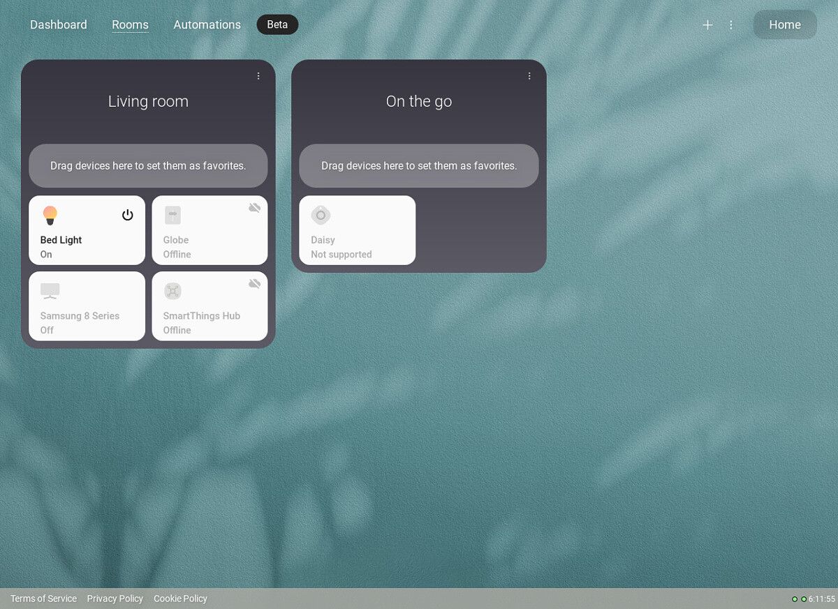
Once you log in to the SmartThings web dashboard with your Samsung account, you’re greeted with the main screen that lists your favorite devices — these don’t sync with the mobile app yet, but they will at some point. There’s also a tab that displays all your rooms and the devices in each one, as well as an ‘Automations’ page that shows your smart home scenes and active third-party connections.

Samsung SmartThings web dashboard rooms page Samsung SmartThings web dashboard automations page

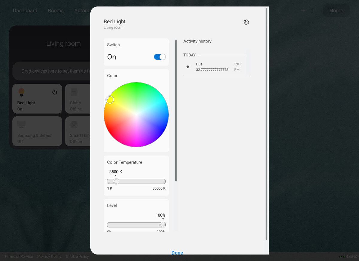
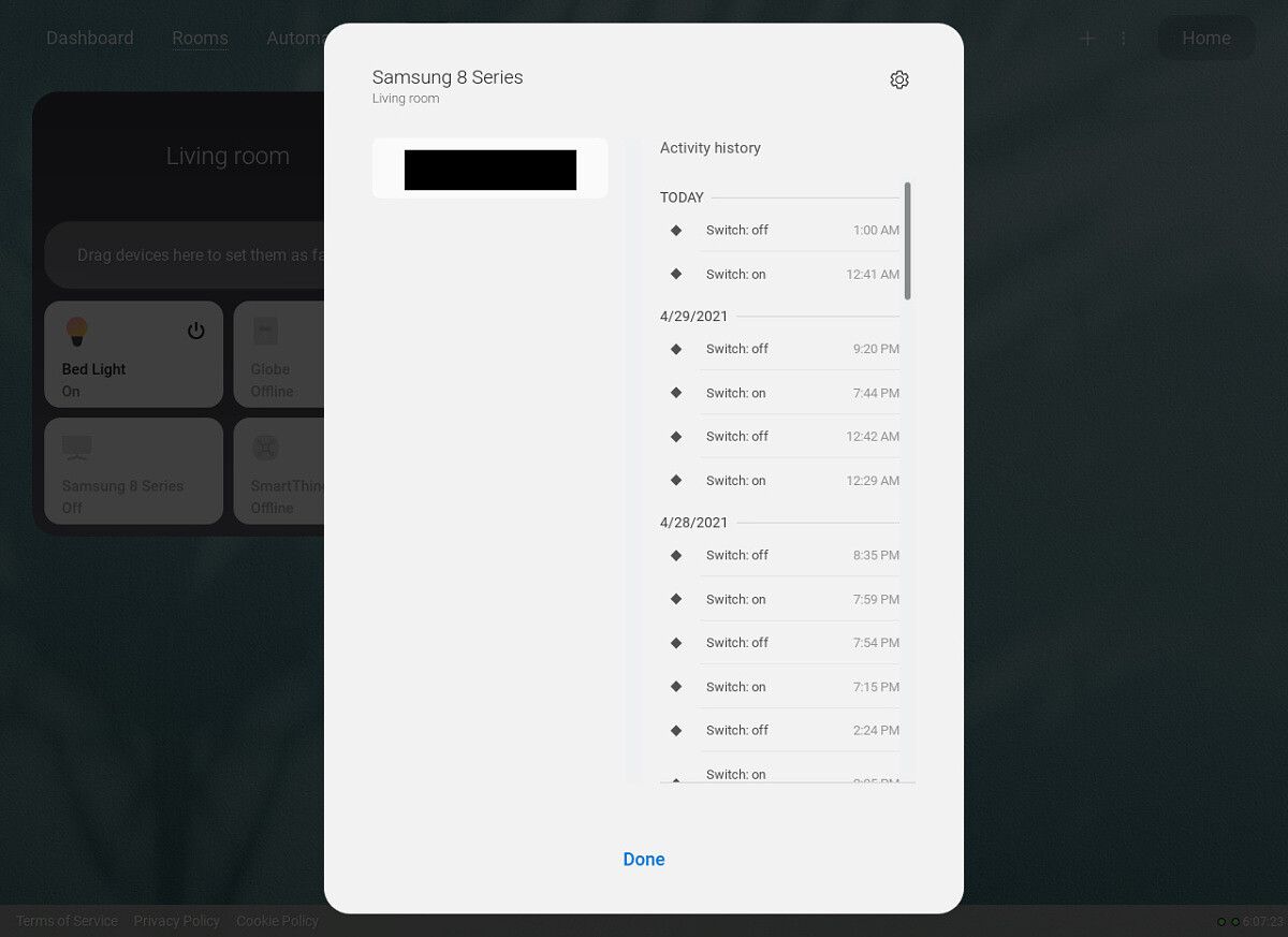
All of your connected devices should be listed, though not all of them can be controlled through the web app yet. For example, there are no controls at all for my Samsung smart TV, even though the mobile app lets me to power it on/off, change channels, and open apps. My Galaxy SmartTag isn’t supported at all (yet), but my Kasa smart lights work perfectly.

Samsung SmartThings web dashboard TP-Link Kasa smart lights control

It would be great to see Samsung continue to develop the SmartThings web panel to have as much functionality as the mobile apps. The panel works well on both desktop and mobile, and unlike many other modern web apps, it isn’t slow to open. Google and Amazon don’t have a similar web panel for their smart home ecosystems (except the basic Alexa web app for connecting/disconnecting third-party services), so Samsung is alone in expanding access to the web.

Samsung previously offered a Windows application for managing SmartThings, but it was deprecated in 2019. The company is now working on an updated desktop application, primarily designed for its new Galaxy Book Pro laptops.

SmartThings (Free, Google Play) →

The post Samsung is working on a web dashboard for SmartThings appeared first on xda-developers.


from xda-developers https://ift.tt/2QO9X82
via IFTTT

New Good Lock module gives you more ways to automate Samsung Bixby

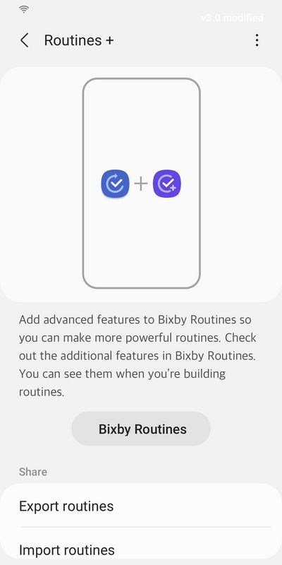
Samsung has quietly introduced a new Good Lock module that allows users to make more powerful Bixby Routines. Called Routine+, the new module is available now in Samsung’s Galaxy Store.

According to the listing for Routine+, the new module allows users to “add advanced features to Bixby Routines so you can make more powerful routines.” Additionally, Routine+ adds more conditions, actions, and the ability to share these more advanced routines. Here’s the listing’s description:

  • Description
    • Add advanced features to Bixby Routines so you can make more powerful routines.
    • Get additional features for your Bixby Routines.
  • Features:
    • Added conditions – Unlock with fingerprint, Air action(Using S Pen), Button action
    • Added actions – Read text aloud, Arrow key, Touch macro
    • Share (Share via QR code, Export routines, Import saved routines)
  • * Only available to Routines + users. Supported languages: English, Korean, Chinese(TBD)
  • * Please install Android OS 11 and OneUI3.1 or later for a pleasant experience while using Routines +. * Feature availability may vary by device model/OS version.

According to Samsung, to use Routine+ you must install Android 11 and OneUI 3.1 or later. The module currently supports English and Korean.

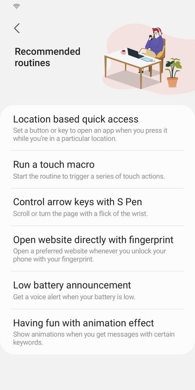
Samsung Good Lock Routine+ Samsung Good Lock Routine+ recommended routines

Some of the recommended routines in Routine+ include location based quick access, running a touch macro, and controlling arrow keys with S Pen. You can also set a website to open every time you unlock your phone with your fingerprint. You can also get a voice alert when your battery is low and show animations when you get messages with certain keywords.

Routine+ looks like a pretty cool addition to the experience, and appears to provide users with a lot of control.

If you’re unfamiliar with Samsung’s Good Lock, now may be a good time to explore what it has to offer. Good Lock offers a suite of officially developed mods that allow users to customize their experience. Earlier this year, Samsung released Good Lock 2021 for devices running One UI 3 based on Android 11, adding new features to the Theme Park, Wonderland, and NavStar modules.

The post New Good Lock module gives you more ways to automate Samsung Bixby appeared first on xda-developers.


from xda-developers https://ift.tt/3tbTibM
via IFTTT

Google Discover appears to be getting a facelift in Android 12

Google Discover appears to be testing a new design in Android 12. The new look changes the alignment of the Google logo while also stripping it of color. Going forward, the logo will either be white or gray depending on your system’s theme.

The new-look Google Discover was first spotted by Android Police, which said the changes are currently only available in Android 12. The redesigned UI also moves the inbox icon right next to your account profile. It’s by no means a major change, and as far as we can tell there’s nothing functionally different.

Google Discover arrived as a rebranding of Google Feed (itself a rebranding of Google Now) back in 2018. Discover is designed to show people trending news, evergreen content, and other information in a scrollable format. It’s a helpful feed for surfacing content even before you need it.

Over the years — Google Discover was launched in 2018 — the experience has become much more visible. When the Galaxy S21 series was announced, it was revealed the series featured Google Discover feed integration into its launcher. We’ve also seen Discover appear on other devices, underscoring what a quality service it is.

The latest UI change to Google Discover is admittedly minor, but sometimes small visual changes can have a lasting impact on the experience. Seeing the Google logo now left-aligned makes the experience feel less like a search engine and more like the helpful service it’s trying to be. It’s become so prominent that Microsoft added a Google Discover-like news and weather feed to the Windows 10 taskbar.

It’s unclear how widely available the new look will be, or if Google Discover will go back to looking like its old self. It’s also unclear if the small redesign will only be available on devices running Android 12, which appears to be the case at the moment. With Google set to hold its I/O conference in May, perhaps we’ll learn more about what kind of tweaks are being planned.

The post Google Discover appears to be getting a facelift in Android 12 appeared first on xda-developers.


from xda-developers https://ift.tt/3nzRTKW
via IFTTT

Apple’s new iMac makes the All-In-One PC sexy again

Apple recently revealed the new, updated iMac — which is now available for pre-order — with M1 chips and an ultra-slim frame. It’s also available in up to seven colors — and it’s gorgeous in a way Apple’s All-in-One hasn’t been for a while.

The new iMac is an impressive piece of hardware, with the aforementioned M1 chipset, a crisp 24-inch 4.5K Retina display, with an all-new built-in camera, mic, and speakers that are big upgrades over the previous models. The rest of the hardware is also impressive, but it’s not really the internals that will draw most people to this device — they’re a bonus, to be sure, but what makes this new iMac so stunning is how it looks.

One of the first and most striking features you’ll notice about the new iMac is its very slim profile. At just 11.5 millimeters, it’s more slender and aesthetically pleasing than ever and just looks right. The thin monitor combined with the graceful swoop of the stand is sure to catch the eye of those looking for that minimalistic look in their tech.

The real draw is the color range. No longer will you be constrained to just the usual silver when looking for a new iMac. The new all-in-one has an impressive seven-color range (though, to be fair, one of those is the aforementioned silver). Every color of the rainbow is represented: Yellow, Orange, Blue, Green (that looks more like teal), Purple, and Pink (that looks very, very red).

Each iMac will have a bright splash of color across its back, and a softer, more muted tone of the same color around the sides and the stand.

The range of colors recalls the iMac G3, that beautiful bubble-shaped iMac that came in a variety of different colors. While the new iMac doesn’t have quite as many colors as its predecessor, it’s still good to see the infusion of bright shades back into the line. In fact, some of the colors of the new iMac look like updated versions of the colors in that older computer. The new blue-ish teal looks very similar to the “Bondi Blue,” the first color with which the G3 was released. The dark purple and pink also look similar to colors in the G3 family.

In case the striking color array wasn’t enough — and, just looking at the computer, it should be — almost all of the accessories can be color-matched to the iMac. The new keyboard, the mouse, the trackpad, and even the cable and power connector can be the same color as your all-in-one. If you’re used to the usual colors of white, grey, and black in all of your tech, this new pop of color and the fact that everything can match might bring a tear to the eye.

Magic Mouse in different colors

Obviously, looks aren’t everything. The way the computer works and what kind of software it supports are the sort of things that will really matter in the day-to-day, not the color.

But it’s also important for the new iMac to look visually different from its predecessor. This is the first redesign of the iMac in a decade, but it won’t resonate with potential buyers so much if it looks identical to the computer that came before it, no matter how impressive the hardware is. So adding an expanded (and pretty) color selection is a visual shorthand for marking the generational differences.

Apple’s new 24-inch iMac is up for pre-order starting today. You can place a pre-order from Apple.com, Amazon, or Best Buy, and shipments will arrive in the second half of May. For more details on the pricing, availability, and specifications, check out our buying guide.

    Apple iMac 24-inch (2021)
    Apple's new 24-inch iMac not only comes in several different playful colors but also packs an incredibly fast M1 chip and beautiful 4.5K Retina display.

The post Apple’s new iMac makes the All-In-One PC sexy again appeared first on xda-developers.


from xda-developers https://ift.tt/3xErxfy
via IFTTT

Facebook Messenger and Instagram chats won’t be encrypted by default until at least 2022

Facebook has received plenty of criticism over the past few years, partially because the company has a near-monopoly on messaging and social networks in some countries, and also due to Facebook’s abhorrent track record with user privacy and data. The company has been slow-moving to improve its public perception, and one element of that — encrypting messages between users without having to change any settings — won’t be ready anytime soon.

Facebook first rolled out end-to-end encryption in its Messenger app in 2016, though it’s only available by switching to a ‘Secret Conversation’ mode, which also prevents some features from working. Instagram hasn’t rolled out end-to-end encryption for messages and has even been testing features that seemingly won’t work over E2E connections (like messaging on the desktop). Facebook said in 2019 that it would eventually add E2E encryption to Messenger, WhatsApp, and Instagram. The company also revealed earlier that year that all three platforms would be switched to a unified infrastructure, allowing cross-communication between all three services.

Facebook announced updates to its safety and security plans in a blog post today. The post primarily focused on the results of studies and interviews about privacy, but nestled in the text is a blurb about the status of end-to-end encryption on Facebook’s platforms:

While we expect to make more progress on default end-to-end encryption for Messenger and Instagram Direct this year, it’s a long-term project and we won’t be fully end-to-end encrypted until sometime in 2022 at the earliest. Moreover, the safety features we’ve already introduced are designed to work with end-to-end encryption, and we plan to continue building strong safety features into our services.

It’s a bit surprising that Facebook is taking years to implement end-to-end encryption across all its services, especially considering the planning started as early as 2019. Adding the required infrastructure and client-side software to handle E2E across several platforms is tricky, but it seems like Facebook is prioritizing other features.

In the meantime, other messaging services like Signal and Telegram are continuing to steal users from Facebook’s services, largely due to the company’s poor privacy. Both apps received a spike in downloads following the controversy around WhatsApp’s planned changes to its terms of service, though Instagram, WhatsApp, and Facebook Messenger remain near the top of the Play Store’s free apps (as they have for years).

Messenger – Text and Video Chat for Free (Free+, Google Play) →

Instagram (Free+, Google Play) →

WhatsApp Messenger (Free, Google Play) →

The post Facebook Messenger and Instagram chats won’t be encrypted by default until at least 2022 appeared first on xda-developers.


from xda-developers https://ift.tt/2QJNEk2
via IFTTT

EU accuses Apple of anticompetitive App Store policies

The European Commission on Friday said it is formally accusing Apple of engaging in anti-competitive behavior. The Commission said Apple is guilty of abusing its dominate position and has an unfair advantage when competing against other apps in the App Store.

The ruling follows an initial complaint from Spotify back in 2019, and takes issue with an App Store policy related to the mandatory use of Apple’s in-app purchase system. The Commission said it’s also concerned with a rule that prevents developers from informing users about alternative ways to purchase software or services. These strict rules “disadvantage competing music streaming services” and “deprive users of cheaper music streaming choices,” the Commission said (via The Verge).

Additionally, the Commission said that Apple’s App Store policies result in higher prices for consumers. Apple imposes a 30% commission fee on all in-app purchases, which is passed onto consumers because companies raise subscription prices.

The Commission’s accusation only relates to the App Store’s practices for music streaming. Apple is also being investigated over practices related to ebooks and the App Store in general, so more rulings could soon follow. The Commission may also look at the App Store’s policies related to games, which has become a major topic of debate over the last several months.

This is just the first step in proceedings, where the Commission informs Apple, who will have an opportunity to respond. Apple is facing a fine of up to 10% of its annual revenue if found guilty, and could also be forced to completely change how the App Store operates.

Apple is facing a number of accusations over its policies, with its fight against Epic Games being among the most high profile. In a separate case, the Australian Competition & Consumer Commission said there were “significant issues” with how Apple (and Google) operate its App Store, and the control the company has over third parties.

The post EU accuses Apple of anticompetitive App Store policies appeared first on xda-developers.


from xda-developers https://ift.tt/2QJarwk
via IFTTT

Google still struggles with transparency over Play Store app removals

Android as an OS has been around for over a decade now and compared to iOS, it does offer a lot more freedom. However, Google maintains dominance over app distribution on the Android platform. Even if Android is open to third-party app stores and sideloading, we can’t trivialize Google’s hold over the smartphone ecosystem built up over many years. This hold is the result of millions of app developers contributing meaningful app experiences to the platform over its existence, giving users a reason to use a smartphone with Android. Google and app developers have a symbiotic relationship, but it’s not one where the power dynamics are equal. Time and time again, we’ve seen complaints from long-standing developers whose apps were punted from the ecosystem, with the explanation for such removals found in vague or automated emails from Google.

Case in point: DroidScript

David Hurren, the founder of DroidScript.org, reached out to tell us about his recent experience dealing with Google Play’s developer support. For those unaware, DroidScript is an app that serves as a mobile IDE, allowing novice developers to create Android apps directly on their phone. The app is designed to make Android programming more accessible to beginners and non-professionals or to those coming from a Web development environment as DroidScript revolves around JavaScript use. While the app does look dated, it had around 1.5 million downloads over 7 years with ~105,000 active users, according to the developer. For an app made by a small, not-for-profit organization, those are good numbers.

Screenshots from DroidScript’s now-removed Play Store listing.

According to David, Google Play recently removed the DroidScript app from the Play Store on suspicion of committing ad fraud. Ad fraud is a serious matter, so a removal would be valid if that is indeed what happened. David denies any such thing occurred, which means of course he was going to appeal the decision. The problem, as usual, is that appealing a decision to Google can lead to an incredibly frustrating experience.

As David presents it, Google first disabled their AdMob account for “Invalid Traffic”, and upon appeal, further suspended the account for Ad Fraud. The appeal response came within 11 minutes and read as if it was automated. What makes matters murky is the lack of transparency that Google maintains regarding these matters. The developer insists that they only have a single banner ad in their app and had been using AdMob without issues for about a year when they received this notice and ban out of the blue.

To make matters worse, a week later, when the developer was working on removing AdMob from the app, they received a suspension email from Google Play for their app DroidScript. This email had some more details, like “APK:206 Ad Fraud. App violates Ad Fraud policy.”, but that is about it as far as transparency goes. Upon appeal, Google added “Malware” as a reason too, after taking 12 days to respond to the appeal:

During review, we found that your app violates the Malware policy. We don’t allow apps with any code that could put a user, a user’s data, or a device at risk. If your app was developed by a third party, we recommend contacting them to verify that they designed your app to comply with our policies. You can read through the Malware policy page for more details and examples of common violations.

Your app is not compliant with the Ad Fraud policy. Ad fraud is strictly prohibited. Ad interactions generated for the purpose of tricking an ad network into believing traffic is from authentic user interest is ad fraud, which is a form of invalid traffic. Ads should not be shown in a way that results in inadvertent clicks. Forcing a user to click an ad or submit personal information for advertising purposes before they can fully use an app is prohibited. Ads should not appear after the user has exited the app, or after the user has pressed the back button to exit the app.

The “Ad Fraud” policy mentioned in this email is a direct copy-paste from this Google support page, and it gives the developer no information on exactly which part of the policy their app violates. The “Malware” policy doesn’t seem to be a direct copy-paste but reads as boilerplate text that doesn’t describe what exactly about the app is malicious. Further emails generated more boilerplate responses and no useful information.

DroidScript remains suspended from the Google Play Store, for reasons not entirely clear. The developer’s account and other applications remain visible, including a few plugins for the main DroidScript app. Since the app is no longer published on Google Play, premium subscribers are having their subscriptions automatically canceled. That, coupled with the loss of 30% of revenue due to the AdMob suspension, is crippling the team behind the app, says David.

The suspension is also affecting projects dependent on DroidScript. One user responding to the announcement from the DroidScript developer says their apps developed in the IDE are still up on the Play Store, while another worries about the removal’s effect on their ongoing commercial development project.

What Google did (and continues to do) wrong

The issue with this incident isn’t that a long-standing app was booted off the Play Store. This is not the first time it has happened to someone, and it certainly won’t be the last time either. The issue here is Google’s reluctance to share details of how developers allegedly violate their policies. There are good reasons why Google can’t delve too deeply into what triggered their ad fraud detection — you don’t want to give malicious actors insight into Google’s detection algorithms so they can work around them — but for developers who are genuinely unaware of why their app was removed, they’ll face difficulties fixing the problem.

In response to complaint after complaint about a lack of transparency in app takedowns, Google issued a Play Policy Update in July 2020 seeking to address the matter.

Google Play Developer Console July 2020 policy update detailed violation email

Under the new policy, Google promised to be more transparent about the actual policy violation that resulted in an application being terminated. Developers were promised to be provided more details, such as a text excerpt from the Play Store listing or even a screenshot of the alleged violation. Google had also promised to add guidance to correct the issue. The overall idea was to make the violation clearer and a fix accessible, which would be very helpful for developers trying to navigate the complex jargon of Policy documents. Not all violations are intentional and malicious, and developers who are innocent are likely to fix such unintentional violations when they are helpfully pointed in the right direction.

We don’t know for sure if DroidScript and its developer are free of fault. It’s possible that the developer is indeed guilty of what Google has accused them of. We have no way of determining whether or not ad fraud occurred, and while we haven’t done a full teardown of the app, a quick analysis on VirusTotal and MetaDefender shows no obvious signs of malware. We don’t know Google’s side of the story here, but that’s kind of the problem. (We have reached out to Google for comment and will update this article if we hear back.)

What is ultimately disappointing is the fact that Google is still following practices that it had recognized were detrimental to developer interest. Google had promised to update its procedures to make them more developer-friendly, but they are still removing apps with as little transparency as before. To be clear, there is overlap between AdMob and Google Play suspensions, and better reasoning should have emanated from the Google Play side. But knowing the tight integration within its own ecosystem that Google pushes for, it should have been willing to offer some more helpful words and an opportunity to remedy violations, if any. Because it sure would hurt to see 7 years of progress wiped out by a few emails that look like they weren’t written by humans.

The post Google still struggles with transparency over Play Store app removals appeared first on xda-developers.


from xda-developers https://ift.tt/330xuoU
via IFTTT

Roku follows through with its threat to remove the YouTube TV app

After warning customers they may lose access to YouTube TV, Roku on Friday removed the app from its channel store, escalating a disagreement between the two companies. If you currently have the YouTube TV app on your Roku device, you can still access it, but new users can no longer download it to their device.

The latest development is related to an expired distribution agreement between Roku and Google for YouTube TV. Roku has accused Google of seeking “unfair and anticompetitive requirements to manipulate your search results, impact the usage of your data and ultimately cost you more.”

“While we are deeply disappointed in Google’s decision to use their monopoly power to try and force terms that will directly harm streamers, we remain committed to reaching an agreement with Google that preserves your access to YouTube TV, protects your data and ensures a level playing field for companies to compete,” Roku previously said.

In response to today’s news, Google published a blog post (via Droid-Life) accusing Roku of requesting special treatment.

“Our initial conversations started with Roku simply to renew the current terms of their ongoing deal with YouTube TV, which has been in place for several years,” Google said. “Our offer to Roku was simple and still stands: renew the YouTube TV deal under the existing reasonable terms. However, Roku chose to use this as an opportunity to renegotiate a separate deal encompassing the YouTube main app, which does not expire until December.”

Google goes on to say that it never made any quests to access user data or interfere with search results. “This claim is baseless and false,” Google said. The search giant does seem to admit, however, that Google is adamant Roku get on board with the AV1 codec — something that was speculated earlier this week.

“Our agreements with partners have technical requirements to ensure a high quality experience on YouTube,” Google said. “Roku requested exceptions that would break the YouTube experience and limit our ability to update YouTube in order to fix issues or add new features. For example, by not supporting open-source video codecs, you wouldn’t be able to watch YouTube in 4K HDR or 8K even if you bought a Roku device that supports that resolution.”

It sounds like discussions are ongoing, but judging by their statements, it doesn’t sound like either company is willing to budge. Ultimately, the consumer loses out, because it means Roku users can’t download YouTube TV — at least for the time being. We’ll bring you updates as they’re made available.

YouTube TV - Watch & Record Live TV (Free, Google Play) →

The post Roku follows through with its threat to remove the YouTube TV app appeared first on xda-developers.


from xda-developers https://ift.tt/3eDFT7a
via IFTTT

ZTE Axon 30 Ultra Hands-on: A US-bound Android flagship that competes with Samsung’s Galaxy S21

After introducing the world’s first under-display selfie camera that wasn’t quite ready for prime time with last year’s Axon 20, ZTE is back with the Axon 30 Ultra. Despite its “Ultra” moniker, the Axon 30 Ultra actually plays things a bit safer. Sure, there are some gaudy numbers that pop off the spec sheet, including a 144Hz OLED display and not one but three 64MP cameras, but this is still a more conventional glass-aluminum sandwich flagship. This phone seems specifically positioned against Samsung’s Galaxy S21 Plus (but not Ultra). As such, we decided to include a brief comparison in our hands-on.

The ZTE Axon 30 Ultra and its global retail box.

ZTE Axon 30 Ultra 5G: Specifications

Specification ZTE Axon 30 Ultra 5G
Dimensions and Weight
  • 161.53 × 72.96 × 8.0 mm
  • 70˚ side curvature with 4.22mm˚ bend
  • 188g
Display
  • 6.67” FHD+ AMOLED Borderless Curved Display
  • 2400 x 1080
  • 144Hz variable refresh rate (60Hz, 90Hz, 120Hz, 144Hz)
  • 300Hz touch sampling rate
  • 10-bit color depth
  • HDR10+
  • Anti-glare glass coating
  • Corning Gorilla Glass 5 (front and back)
SoC
  • Qualcomm Snapdragon 888:
    • 1x Kryo 680 Prime Core @ 2.84GHz
    • 3x Kryo 680 Performance Cores @ 2.4GHz
    • 4x Kryo 680 Efficiency Cores @ 1.8GHz
  • Adreno 660
RAM and Storage
  • 8GB / 12GB LPDDR5 RAM
  • 128GB / 256GB UFS 3.1 storage
  • MicroSD card support
Battery & Charging
  • 4,600mAh battery
  • 66W fast charger (inside the box)
Rear Camera
  • Primary: 64MP Sony IMX686, f/1.6, OIS
  • Secondary: 64MP f/1.9
  • Tertiary: 64MP ultra-wide, 120-degree field-of-view
  • Quaternary: 8MP telephoto, OIS, 5x optical zoom, 10x hybrid zoom, 120x digital zoom, LDAF
Front Camera 16MP
Ports USB Type-C port
Connectivity
  • 5G (SA & NSA n41/78, SA n1/3/28)
  • WiFi 6E
  • 4×4 MIMO antenna
  • NFC
  • Bluetooth 5.2
  • Dual GPS (GPS L1+L5, A-GPS, Galileo, Glonass, BeiDou)
  • Type-C port
Other features
  • In-display fingerprints scanner
  • Dual speakers
  • DTS: X Ultra sound
  • AI call noise reduction
  • 3-mic Noise Suppression
Software Android 11 with ZTE My OS 11

About this hands-on: ZTE sent me a global version of the Axon 30 Ultra. ZTE had no input in this article.

ZTE Axon 30 Ultra Forums

ZTE Axon 30 Ultra: design and hardware

The ZTE Axon 30 is yet another curvy glass sandwich slab, but the curves here are unlike those found on recent flagships. While everyone from Samsung, OnePlus, and OPPO have toned down the curvature of their screens, ZTE has gone in the opposite direction: the Axon 30 Ultra’s 6.7-inch 1080P OLED screen slopes dramatically. It’s not a steep dropoff like Huawei’s waterfall screens, but it’s more akin to an older Samsung circa the Galaxy S7 Edge era. This results in sharper sides, which coupled with the flat top and bottom, make for an angular, masculine-looking device.

The ZTE Axon 30 The ZTE Axon 30 Ultra has drastic curved screen and flat top and bottom.

The phone feels premium in the hand, with a matte glass back and a camera module that reflects light in a rainbow gradient. At 188g and 8mm, it’s thinner and lighter than Samsung and Xiaomi’s Ultra phones.

The ZTE Axon 30 Ultra measures 8mm thick.

The OLED screen looks great and can refresh up to 144Hz with a 300Hz touch sampling rate. There are options to lower the refresh rate to 120Hz, 90Hz, or 60Hz. I’m not much of a mobile gamer, so I likely won’t take advantage of the 144Hz screen to its fullest potential, but animations looked very smooth to my eyes.

ZTE Axon Ultra's 6.7-inch 1080P OLED screen.

Inside the phone are the usual Android flagship guts: the Snapdragon 888 SoC paired with 8GB of RAM. There’s a 4,600 mAh battery that can be charged at 66W speeds with the included charging brick.

ZTE Axon 30 Ultra: cameras

The unit I’m testing is a global version that will be sold unlocked in the US and Europe. Since the launch is still weeks away, the software on the device is not final — something to keep in mind when we check out photo samples soon.

The Axon 30 Ultra features a quad-camera main system, with the aforementioned triple 64MP sensors flanked by an 8MP 5x periscopic zoom lens. The trio of 64MP cameras — which ZTE dubs the “Trinity Camera System” — covers the usual wide, ultra-wide, and telephoto (2X optical, 35mm) focal range, and all three pixel-bin down to 16MP photos.

The ZTE Axon 30 Ultra's quad camera system.

I stress again this is not a review but rather an early impression, but regardless, photos look really good in a vacuum.

The ZTE Axon 30 Ultra's ultra-wide camera The ZTE Axon 30 Ultra's wide camera The ZTE Axon 30 Ultra's 2x camera

The main camera produces a natural bokeh with a closer subject, and the ultra-wide lens doesn’t exhibit distortion. Because it’s technically got 64 million pixels worth of information (binned down to 16 million), the entire ultra-wide shot is crisp, even the sides, which tend to be soft in less pixel-dense sensors.

ZTE Axon 30 Ultra's main camera producing a nice natural bokeh. Ultra-wide angle shot with the ZTE Axon 30 Ultra.

There is a bit of color inconsistency between the main and ultra-wide cameras (they use different sensors: Sony IMX686 and Samsung GW3, respectively), but again, this is not final software, so perhaps this will be fixed in the retail software. The differences aren’t too bad anyway.

Since the ZTE Axon 30 Ultra will likely be priced below the $1,200 range of the Galaxy S21 Ultra, it seems the Galaxy S21 Plus is a better comparison for this hands-on, so I grabbed a few shots with both phones.

The silver Samsung Galaxy S21 Plus and the dark grey ZTE Axon 30 Ultra.

In standard night photos captured by the main cameras, both phones shot some great-looking images that are very close to call. I do prefer the S21 Plus’ cooler color tones more, particularly in the second set of the busy street market.

Axon 30 Ultra night shot S21 Plus night shot Axon 30 Ultra night shot S21 Plus night shot

However, in the below shot, the ZTE Axon 30 Ultra’s shallower depth-of-field is a more aesthetically desirable shot in my opinion.

Moving to the ultra-wide lens, the ZTE Axon 30 Ultra’s shots tend to be dimmer than Samsung’s because it has far more pixels to fill (the Galaxy S21 Plus uses a 12MP ultra-wide sensor).

Axon 30 Ultra ultra-wide shot. S21 Plus ultra-wide.

But if I zoom in and pixel-peep, the ZTE Axon 30 Ultra’s shot is noticeably sharper and less noisy due to having more pixel information.

A collage of shots captured by Samsung and ZTE phones.

Axon 30 Ultra (left); S21 Plus (right).

ZTE Axon 30 Ultra software

The Axon 30 Ultra runs Android 11 with ZTE’s MyOS software on top. It’s a colorful software that is distinctive visually from stock Android but comes with some nice additions: I like the larger toggle buttons in the notification shade; that I can thumb through an alphabetical column on the right side of the app drawer to quickly reach an app by alphabetical status; and the customizable Always-on display and shortcut gestures.

Other aspects of the software need more refinement, such as the heavy-handed “accidental palm touch prevention” option in settings that gives the option to make entire chunks of the screen lose touch sensitivity. Palm rejection should be done intelligently according to context by the software instead of a straightforward “make half an inch of the screen not functional.”

ZTE MyOS 11 software ZTE MyOS 11 software

Conclusion: The rare Chinese phone to sell stateside gives it a leg up

There are a lot of good Android flagships from Chinese tech brands such as the Xiaomi Mi 11 Ultra, OPPO Find X3 Pro, and the Vivo X60 Pro Plus. But the ZTE Axon 30 Ultra has something on all of those phones — it will be sold in the US. While it’s not going to take a dent out of Apple or Samsung’s pie, with LG shutting down its mobile business, there’s room in the US phone scene for another brand to make an impression.

ZTE Axon 30 Ultra Forums

The post ZTE Axon 30 Ultra Hands-on: A US-bound Android flagship that competes with Samsung’s Galaxy S21 appeared first on xda-developers.


from xda-developers https://ift.tt/2ShO4yz
via IFTTT