LightBlog

vendredi 24 décembre 2021

OPPO Find N Review: Combining the best of Samsung and Huawei’s foldables

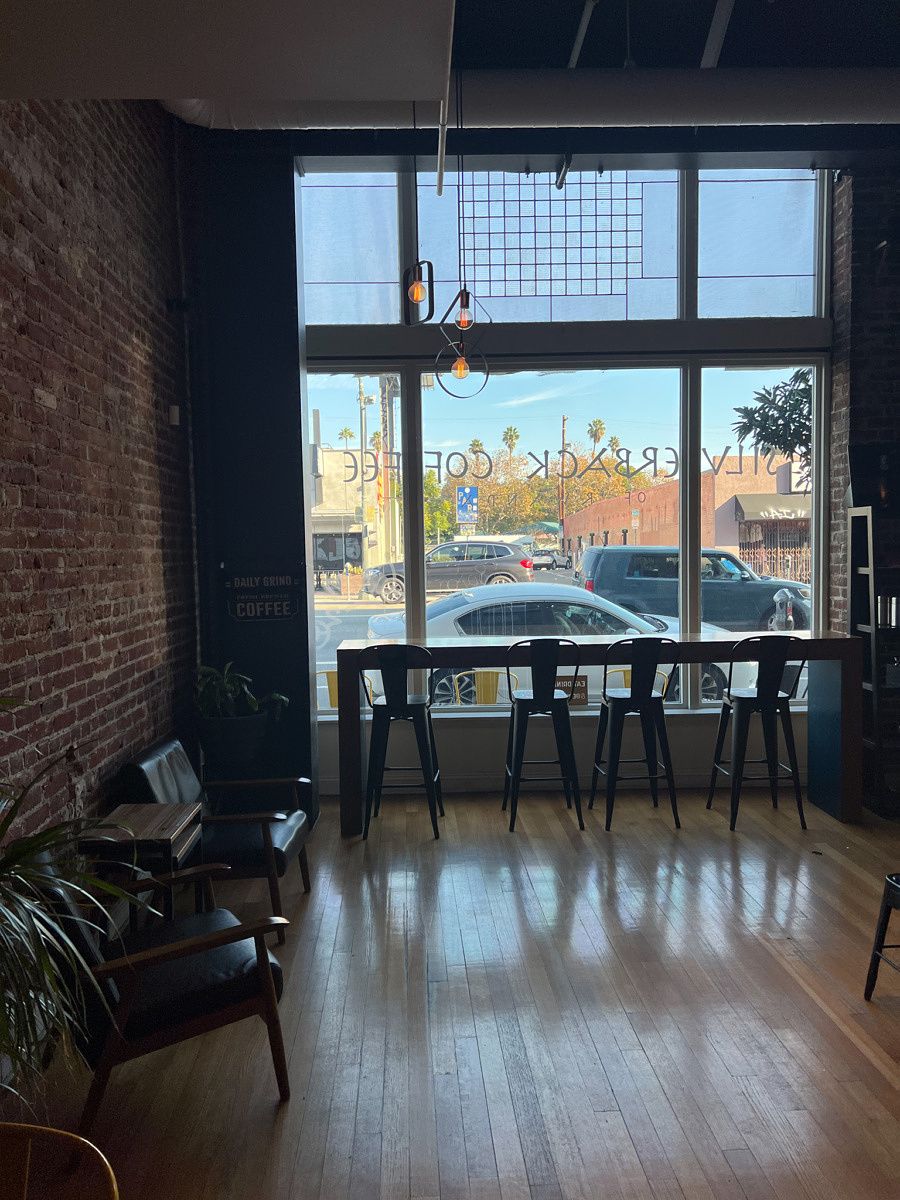
OPPO may be late to the foldable smartphone game — Samsung, Huawei, Xiaomi, Motorola, and even, uh, Royole have already hit the market with foldables. But according to the company’s chief product officer Pete Lau, this late entrance wasn’t due to a lack of ability. OPPO had, in fact, built six foldable prototypes over the past four years — and in a media briefing with Lau, we even caught a glimpse of these devices, which included clamshells, innie-folds, and outer-folds. But ultimately, the company decided to wait until the technology matured.

And with the benefit of hindsight, OPPO could also examine what other companies did right and wrong. And so the company’s first foldable, the Find N, seems to take the best of Samsung’s Galaxy Z Fold 3 and Huawei’s Mate X2 to form one well-balanced package. In fact, this is my new favorite foldable hardware.

OPPO Find N

OPPO Find N Specifications: Click to expand

OPPO Find N: Specifications

Specification OPPO Find N
Build
  • Gorilla Glass Victus front and back
  • Aluminum frame and hinge
Dimensions & Weight
  • Folded: 132.6 x 73 x 15.9 mm
  • Unfolded: 132.6 x 140.2 x 8.0 mm
Display
  • Main
    • 7.1″ flexible OLED with UTG
    • 1792 x 1920
    • 120Hz refresh rate
  • Secondary
    • 5.5″ AMOLED screen
    • 988 x 1972
    • 60Hz refresh rate
    • 18:9 aspect ratio
SoC
  • Qualcomm Snapdragon 888
    • CPU
      • 1x ARM Cortex-X1 @ 2.84GHz
      • 3x ARM Cortex-A78 @ 2.4GHz
      • 4x ARM Cortex-A55 @ 1.8GHz
    • GPU: Adreno 660
RAM & Storage
  • 12GB LPDDR5 RAM + 256GB UFS 3.1 storage
  • 12GB LPDDR5 RAM + 512GB UFS 3.1 storage
Battery & Charging
  • 4,500mAh battery
  • 33W wired fast charging
  • 15W wireless charging
Security
  • Side-mounted fingerprint reader
Rear Cameras
  • Primary: 50 MP, f/1.8, 24mm (wide), 1/1.56″
  • Secondary: 16 MP, f/2.2, 14mm (ultra-wide), 123˚
  • Tertiary: 13 MP,f/2.4, 52mm (telephoto), 1/3.4″
Front Camera
  • 32MP, f/2.4 (main screen)
  • 32MP, f/2.4 (secondary screen)
Port
  • USB Type-C
  • No 3.5mm headphone jack
Audio 
  • Stereo speakers
Connectivity
  • Qualcomm Snapdragon X60 4G LTE and 5G integrated modem
    • 5G: n1/n3/n5/n7/n8/n20/n28/n38/n40/n41/n77/n78/n79
    • 4G: LTE FDD: B1/2/3/4/5/7/8/12/17/20/28/32/66
    • 4G: LTE TDD: B38/40/41/42
    • 3G: WCDMA: B1/2/4/5/8
    • 2G: GSM: 850 900 1800 1900 MHz
  • Dual SIM, Dual 5G standby
  • Bluetooth 5.2
  • Wi-Fi 6E
  • NFC and IR blaster
Software ColorOS 12 based on Android 11

About this hands-on: OPPO provided me with a Find N unit to test. This review is after a week of use. OPPO did not have any inputs in this article.

OPPO Find N Hardware: The Goldilocks foldable

Up until now, foldable phones have been either very small or very large. Clamshell foldables like the Galaxy Z Flip 3 or Motorola Razr are just normal-sized phones that fold in half to become tiny — smaller than even a drink coaster in height and width. Larger foldables like Samsung’s Fold series, Huawei’s Mate X series, or Xiaomi’s Mix Fold, are basically iPad Mini-sized tablets that transform into a modern era flagship slab — which means they’re relatively big even in this form. Samsung and Xiaomi did make their foldables narrower in width, but they’re still tall phones that tower over, say, a standard iPhone.

all three foldables

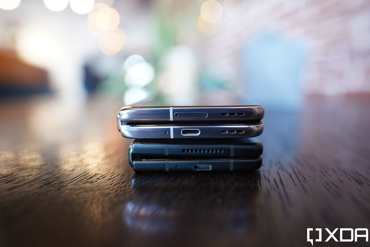
The Samsung Galaxy Z Fold 2, Huawei Mate X2, and Xiaomi Mix Fold

The OPPO Find N is the first foldable to find a balance between the two approaches. Its outside secondary screen measures just 5.5-inches, with a more conventional 18:9 aspect ratio, and thanks to thin bezels and subtle curvature at the edges, this makes the Find N look and feel ultra-compact in folded form. In fact, it’s significantly smaller than an iPhone 13 Pro, which itself is not big by modern slab standards.

OPPO Find N

The Find N with an iPhone 13 Pro

And it’s noticeably shorter and more compact than the Galaxy Z Fold 3.

Find N and Z Fold 3

Find N and Galaxy Z Fold 3

The OPPO Find N is the first foldable to find a balance between too big and too small

And because the Find N’s screen uses an 18:9 aspect ratio compared to the Galaxy Z Fold 3’s 24.5:9, it can display smartphone content in a more “normal” manner, without the cramped and elongated feeling you get from the Z Fold 3. This is of particular importance when typing — onscreen keyboards have always felt cramped on the outer screens of Samsung’s Fold phones, and even worse on the Xiaomi Mix Fold, which leads to more typos. On the Find N, I can peck away at my usual speeds.

typing on the OPPO Find N

The curvature of both front and back glass, along with a more rounded hinge area also makes for a more comfortable in-hand feel than the Galaxy Z Fold 3, whose hinge corners are still slightly sharp (this problem was even worse on the Galaxy Z Fold 2 before it).

The hinge of the OPPO Find N and Galaxy Z Fold 3

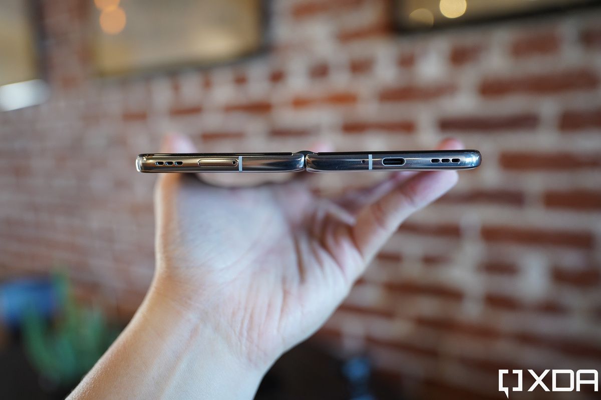
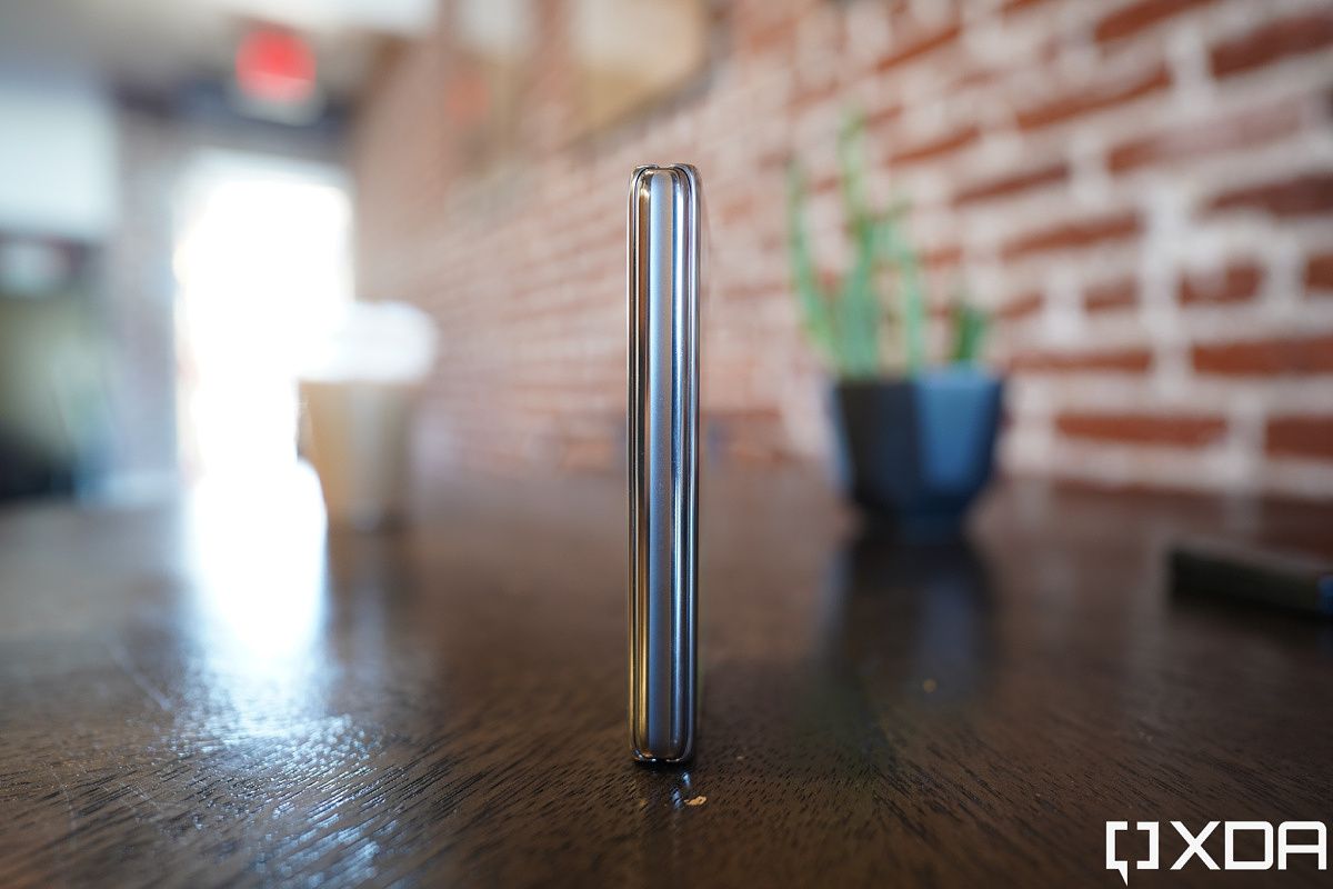
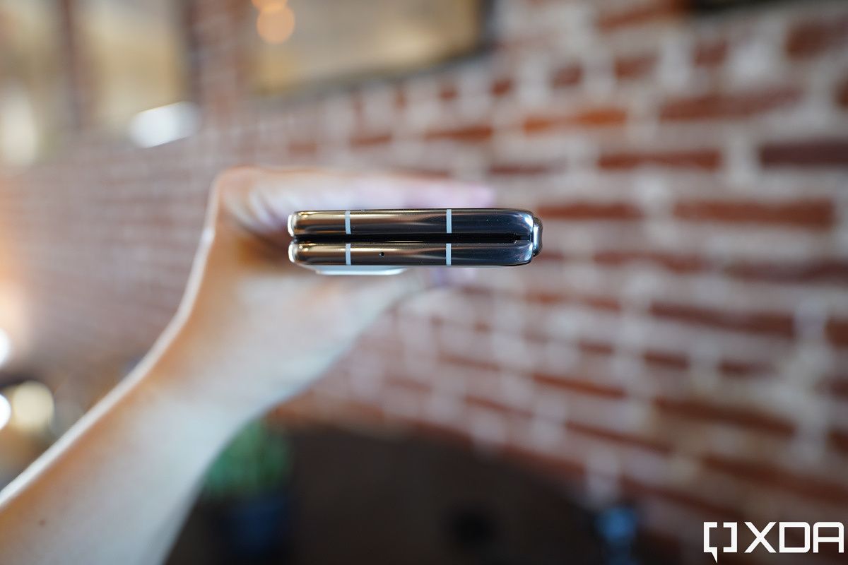
You may notice from the photo above that the Find N also folds completely flat, while the Galaxy Z Fold 3’s folds at an angle and leaves a slight gap. That’s because the Find N’s hinge has a small cavity into which the screen tucks for a less harsh fold than the Galaxy Z Fold 3’s design.

OPPO Find N hinge

This design also means the Find N’s inside screen doesn’t show much of a crease (and it actually has a double crease because of the lenient fold bend). You can spot the double-crease if you look at the screen from extreme angles under certain lighting, but it’s far, far less noticeable than the crease in the Galaxy Z Fold 3.

Find N crease and Fold 3 crease

Find N (left), Galaxy Z Fold 3 (right).

The Find N’s main screen is a 7.1-inch, 1792 x 1920, 120Hz panel, and it looks and feels great. It’s covered by ultra-thin glass so it feels less plasticky than Xiaomi and Huawei’s foldable and more like Samsung’s foldables — the screen, in fact, is sourced from Samsung. And animations are buttery smooth, although quite jarring when jumping back to the mere 60Hz outside screen.

OPPO Find N

In the last week, the Find N has received a lot of gushy praise from tech media for this hinge design that has mostly eliminated the crease and the gap. I have to add some context to that. While this is a damn great design, the Find N is not the first to offer this design. We’ve seen it in Motorola’s Razr foldables, and in more direct comparison, the Huawei Mate X2, too. In terms of look and feel, the Find N’s hinge is very similar to the one seen in the Huawei Mate X2.

But OPPO improves on this hinge by adding a trick pioneered by Samsung: the ability for the hinge to stay open mid-fold at any angle. Samsung calls this “Flex Mode,” OPPO calls its take “FlexForm Mode,” but they work the same way. Right now, only Samsung and OPPO foldables can do this — and it is a very practical feature that further justifies the point of foldables.

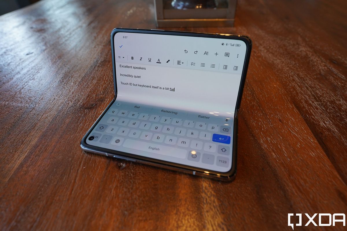
The hinge being able to stay halfway folded allows the Find N to be used as a mini laptop, and because the screen aspect ratio is wider than the Galaxy Z Fold 3, the keyboard is less cramped too. I actually can type slightly faster in laptop mode with multiple fingers than just two-thumb typing.

Find N in laptop mode. find n hinge

This form also lets users take photos or videos, or watch media, hands-free. For example, I was able to take this photo of myself in front of a graffiti wall without needing a tripod.

oppo find n flexform mode.

Battery and Memory

The OPPO Find N, despite its compact size, packs a 4,500 mAh battery that is slightly bigger than the 4,400 mAh cell in the Galaxy Z Fold 3. And because the outside screen is just a 60Hz panel and OPPO’s Chinese ROM software has some aggressive battery management (more on this in the software section), the Find N’s battery life has been stellar. In the first two days of use, I would unplug at 9 am, use it heavily all day, and still have around 40% battery 15 hours later by midnight. But this is with OPPO’s overly aggressive battery optimization that has unintended side effects (again, more on this in the software section). After I disabled the aggressive battery micro-management, I still finished 15-hour days with 25% battery left. This phone should be able to go all day for anyone. Topping up can be done via the included 30W fast charging brick or wireless charging.

With 12GB of RAM and at least 256GB of storage (my unit has 512GB), the Find N is as well equipped as many modern flagships. In my week of heavy use I have not experienced app launch stutters or crashes.

Hardware nitpicks

There are some nitpicks to be had with the hardware: the Find N only has two speakers (Samsung, Xiaomi and Huawei’s large screen foldables have four), and they’re both located on the bottom of the Find N, so you are not getting immersive stereo sound. And while the hinge feels very sturdy and well-built, there is no official IP rating like Samsung’s Galaxy Z Fold 3 either. The phone’s Snapdragon 888 SoC will also be officially “last-gen” in a few weeks as flagships with the Snapdragon 8 Gen 1 get announced. Still, considering the Find N’s relatively low price (7699 yuan, which converts to around $1,206), these can’t be called anything but nitpicks.


OPPO Find N: Cameras

There are five cameras on the OPPO Find N: two 32MP selfie cameras (one on each screen), and a triple-camera main system headlined by a 50MP, f/1.8, 1/1.58-inch sensor, along with a 16MP ultra-wide and a 12MP telephoto lens that can do 2x optical zoom. While the main camera is the same one used in the Find X3 so it is quite capable, the latter two lenses are inferior to what was seen in the Find X3, which means, once again, a foldable phone is using a compromised camera system that is not the company’s best optics.

OPPO Find N camera system

The Find N’s triple-lens array consists of a 12MP telephoto (top), 50MP main (middle), and 16MP ultra-wide (bottom)

For the most part, the Find N can still produce great shots — and the camera definitely holds up well against the Galaxy Z Fold 3’s cameras — but for someone like me who’s been spoiled by jaw-dropping, world-beating cameras seen in the Vivo X70 Pro Plus and Google Pixel 6 Pro, I can’t say the Find N camera really wows me. For example, the OPPO Find X3 had an awesome ultra-wide camera that produced shots almost as sharp as the main camera. The Find N can’t do this since the ultra-wide sensor got downgraded, so if you pixel peep, you can clearly see that ultra-wide photos are softer and less detailed, especially at night.

In the below set, we can see the Find N’s main camera blows out the skies a bit compared to the iPhone 13 Pro’s shot. The ultra-wide battle is closer, with the Find N’s shot looking punchier and livelier, but in a scene like this shooting against backlight, some contrast (shadows) may be preferred.

The OPPO Find N’s telephoto zoom lens can capture 2x optical zoom and digital zoom up to 20x. If we stick to 2x, the shot is clean and sharp.

But if we go up to 10x zoom, which is purely digital crop, shots are noticeably not as good as what the Galaxy S21 Ultra or Pixel 6 Pro can do, however, if we compare the Find N against the Z Fold 3, the OPPO foldable’s digital zoom is still a bit better (less noise) than the Galaxy Z Fold 3’s 10x zoom.

The Find N’s main camera does a great job at night thanks to the combination of pixel-binning and relatively large sensor. Colors and dynamic range are on point in both shots below.

Selfies and portrait shots all turn out quite good — overall the Find N’s camera system is very good unless you have been spoiled by the absolute best cameras (again, the Vivo X70 Pro Plus and Google Pixel 6 Pro).


OPPO Find N Software: Awesome gesture and customizations but needs some polish

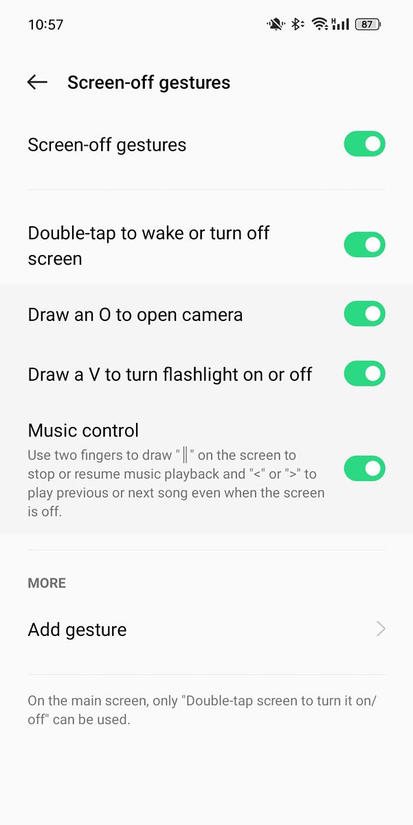
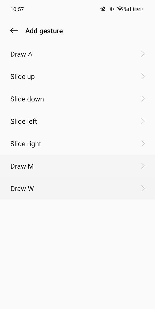
The Find N runs ColorOS 12 over Android 11, and when the phone is folded up, the software behaves like any other recent OPPO phone, which in my opinion is a great thing — because ColorOS is very similar to OxygenOS, which most would agree is a very smooth and useful Android skin. ColorOS, like OxygenOS, is highly customizable, both in aesthetics and using the phone. We don’t just have the option to change UI color scheme, icon shape and sizes, and animation speeds, but we also have a myriad of shortcut gestures, from a quick launch sidebar that can be pulled into homescreen with a swipe, or screen-off gestures, which allows us to trigger actions or launch apps by scribbling a shape onto a sleeping screen (without needing to wake up the screen). I absolutely love the screen-off gestures and wish other phones would adopt them: I can, for example, turn on the flashlight by drawing a V, or skip music tracks by scribbling an arrow (“>”), all without needing to wake up the screen. OPPO even lets us customize these gestures, so I can, say, launch Google Maps by drawing an M.

Speaking of Google, because the Find N is officially selling only in China, it does not come with Google apps, but these can be installed very easily. OPPO’s own app store has the Google Play Store, so it’s just a matter of downloading and installing.

I absolutely love ColorOS’ screen-off gestures and wish other phones would adopt them.

However, like most China market-only phones, the battery optimization is overly aggressive, to the point that the phone breaks push notifications — meaning you may not be notified when someone sends you a WhatsApp message because the Find N has put WhatsApp to sleep. I can solve this problem by diving into settings and turning off battery optimization for important apps like WhatsApp, Slack, and Gmail, but it is really annoying that we have to do this. Chinese brands — please stop with the aggressive battery optimization! Nobody likes opening a chat app just to realize there are 12 messages sent hours ago waiting to be read. We will gladly sacrifice some battery life to be able to get notifications in time. Seriously, please stop doing this!

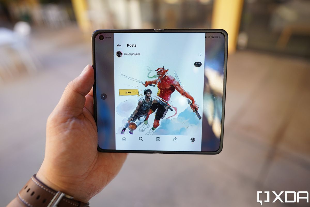
So that’s ColorOS when used as a normal slab phone. OPPO has made further changes to the UI for when the Find N is unfolded — in tablet mode. The biggest additions are quick gestures to help multi-task. With any app opened, swipe down the middle with two fingers to activate the split-screen mode. The gesture feels like you’re slicing the screen in half and the animations add to that whimsical feel. You can also pinch with three or four fingers on an app and the app will shrink into a floating window that can then be resized.

Not every app works: Instagram, for example, refuses to be split-screened or float. But 90% of apps I use worked well. And because the Find N’s inside screen has a wider landscape aspect ratio, it can display two apps side-by-side in a more native format than the cramped, narrower Galaxy Z Fold 3 screen. Notice in the photo below, XDA’s homepage is looking very cramped on the Galaxy Z Fold 3’s split-screen.

Find N

Find N (left); Galaxy Z Fold 3 (right).

However, the Find N’s software as a tablet needs more polish. Because the Android tablet scene is so sad, app developers don’t really bother optimizing apps for Android tablets (at least not like they do for the iPad), so one major problem is some apps will open in the wrong orientation. This usually happens with Android tablets in landscape orientation but the app in question only was written to run in portrait orientation. It’s an issue I encountered with tablets from Xiaomi, Huawei and Samsung too.

On the Find N, for example, YouTube Studios and Uber must open sideways — they refuse to fit into the landscape orientation. But Instagram, another app which only opens in portrait orientation, will open upright on the Find N, but with major pillar-boxing.

This problem was also there for Samsung’s first couple of foldables, but it’s mostly non-existent on the Galaxy Z Fold 3. This is partly because the Galaxy Z Fold 3’s main screen, even when unfolded, is in portrait orientation. But it’s also because Samsung has clearly fine-tuned its UI to make sure apps can be rotated in any orientation. Samsung’s Fold UI can also force any app to stretch across the entire screen, which I find very preferable for a visual-heavy app like Instagram. Pillar boxing just takes away from the immersion.

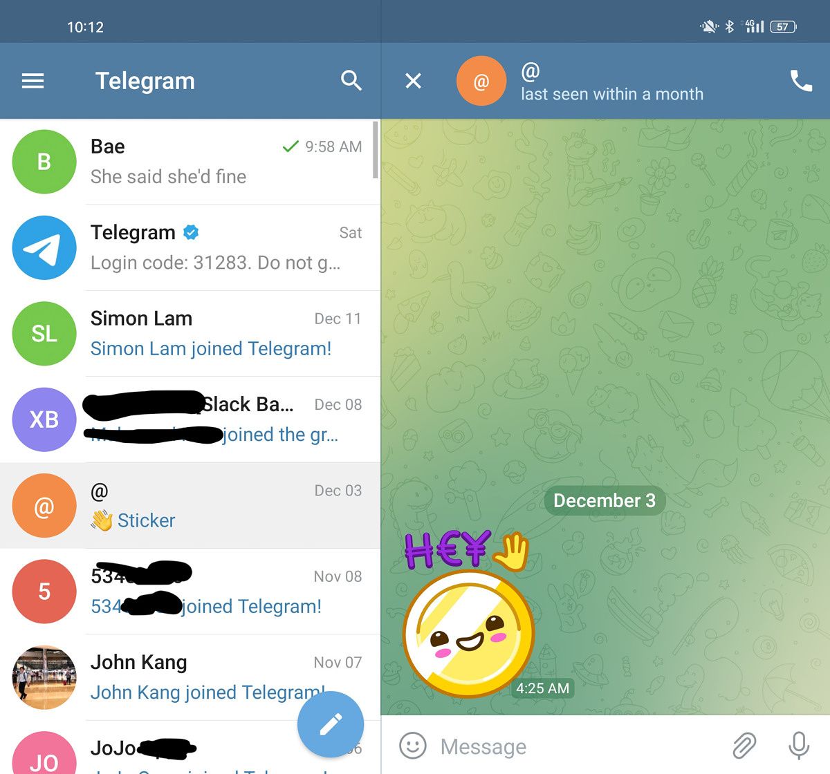
Many third-party apps, from Spotify to Telegram to Gmail, automatically take advantage of the Find N’s larger canvas by showing a two-pane layout.

Overall, considering this is OPPO’s first foldable, the Find N’s software experience can be called good — it just needs a bit more polishing to adapt to the fact that some widely used apps don’t play well with landscape aspect ratio.


OPPO Find N: Conclusion

If we compare the OPPO Find N against competitors, the Find N wins in most cases. The Find N’s screens are clearly superior to the Xiaomi Mix Fold’s screens, which have thicker bezels, slower refresh rates, and a noticeable crease on the inner display. And while the Mix Fold has since gone on discount, if we go by the official retail price, the Find N is cheaper by a thousand-plus yuan or around $200.

If we compare the OPPO Find N against competitors, the Find N wins in most cases

The Huawei Mate X2’s form factor, screen and crease all compete well against the OPPO Find N, and the Mate X2 is still to this day the only foldable to offer a Periscope zoom lens. But its $2,700 price and lack of Google Mobile Services makes this a no contest. You’d have to have no regard for money to want to pay $2,700 over $1,200 for a similar type phone.

Of course, the device most people will compare the Find N against is Samsung’s Galaxy Z Fold 3, and this one is closer. As I already said, I think the Find N’s hardware looks and feels better in-hand than the Galaxy Z Fold 3, but the latter has more polished software. We also can’t discount the fact that the Z Fold 3 has an official IP water resistance rating, stylus support, and Samsung DeX. How important these extra features are depends on the person — I personally have never broken a phone from water damage, and the stylus experience on the Fold is so compromised that my review unit S-Pen Pro has been collecting dust in a drawer somewhere. So the only Fold 3 extra feature I “miss” is Samsung DeX. But your mileage will vary.

oppo find n on a bookshleve

I can say from my usage, I much prefer the Find N’s form factor and aspect ratio. And judging from many of the comments I’ve seen from my peers in tech media and also readers, I think my opinion is shared by many. But ultimately, it’s the price that makes the Find N a winner. For two years, foldable detractors have mocked the price of foldables. Well now OPPO has made a foldable that is not a cent more expensive than a top-tier flagship. I understand that this is China pricing, and if the Find N gets released internationally, the price will surely jump higher. But even if it gets up to $1,500, this is still not far off from a Samsung Ultra or Apple Max phone.

The age of foldables is here

The point is, I think 2022 is the year foldables will finally go mainstream, because if reliable rumors are to be believed, the OPPO Find N is just the beginning. We will get foldables from Honor, Vivo likely soon, and Xiaomi will surely have a follow-up. And since OPPO has set pricing at $1,200, there’s no way Honor and Xiaomi can price their products much higher.

Once multiple brands compete and try to outdo each other, tech breakthroughs happen. Samsung will have no choice but to bring their A-game too. The age of foldables is here.

    OPPO Find N
      The OPPO Find N is a foldable that's neither too big nor too small -- and it has a mostly crease-free screen.

        Pros:

        Cons:

    The post OPPO Find N Review: Combining the best of Samsung and Huawei’s foldables appeared first on xda-developers.


    from xda-developers https://ift.tt/3prXmpT
    via IFTTT

    jeudi 23 décembre 2021

    Exclusive: This is our first look at Android 13 “Tiramisu” and some of its upcoming features

    Android 12 is the current flavor of the season as OEMs go on to update their skins with this new release as their base. If you have a foldable, there’s Android 12L to look forward to, bringing along changes that make it easier to use foldables and other large-screen devices. Now, we bring to you an exclusive look at some of the features and changes you can see in Android 13 “Tiramisu”, the next version of Android that is likely to be unveiled after Android 12L’s stable release.

    If you recall, we at XDA had brought to you your first look at Android 12, and then your first look at Android 12.1 (which Google eventually unveiled as Android 12L). Now, a source with access to a very early Android 13 build has shared with us screenshots of the unreleased version, and through it, we can show off several upcoming features and changes. We have a high degree of confidence in the veracity of these screenshots. But since Android 13 is still quite some time away, features that we show here may or may not make it to the first Developer Preview of Android 13 that is expected to be publicly released in 2022.

    New features expected in Android 13:


    App Languages in Android 13

    Android has offered language selection as a feature since its earliest days. But this selection is applied universally across the device for the most part. Apps can offer their own in-app language settings, but most developers don’t offer this as a dedicated feature. The result of this is that panlingual users have to choose one language they are most comfortable with, and use the phone and all installed apps and services in that one language only. If they do need to switch languages, the switch needs to be made at the system level, accessible from Settings > System > Languages & input > Languages. As long as apps include the strings for the language chosen, they will display that chosen language.

    A recent report from Android Police revealed that Google is working on a new feature, codenamed ‘Panlingual’, for Android 13 that will let users define language settings on a per-app basis. This feature will let users specify language settings for each app individually on their device, which will prove to be quite useful for multilingual users who may prefer different locales for different apps. The feature will appear as a new “App languages” option within the “Languages & input” settings, but users will also be able to access it from the “App info” screen.

    We have access to screenshots that confirm that the feature is being worked on.

    Android 13 App Locale feature Android 13 App Locale feature Android 13 App Locale feature Android 13 App Locale feature

    As you can see above, a new “App Languages” setting is now present within Settings > System > Languages & input. Choosing this option allows you to select an installed app, and change the language it is presented in, without affecting the language of the rest of the system. This way, you can have several different apps set up in different languages as per your need and convenience. Note that this still relies on the app including the relevant language strings, though one cannot rule out a possibility of on-device app string translation down the line.


    Runtime Permission for Notifications

    Every app you install on Android automatically has the ability to push a notification to your device. As the number of apps on our phones increased, so did the number of notifications and the number of apps that send regular notifications. The result is that every app now wants to, and gets to, send notifications on your phone, resulting in notification spam and an unpleasant experience. Newer versions of Android have attempted to tackle it through solutions like Notification Importance (for determining how much the notification can interrupt the user), Notification Channels (to allow certain types of notifications from an app to be treated differently from other types from the same app), and even the ability to turn off notifications entirely on a per-app basis. However, most users do not know these solutions exist, so the notification spam remains practically untackled.

    Google could be taking another step in tackling this menace next year. Android 13 adds a new runtime permission “POST_NOTIFICATIONS” for notifications. This means that notifications could become an opt-in feature on Android 13. Users may be able to choose whether they want to allow an app to send a notification to their device in a fashion similar to how they choose to allow other runtime permissions like Location and Camera access.

    Notifications Runtime Permission on Android 13 Notifications Runtime Permission on Android 13

    It is likely that the new notifications runtime permission will be pre-granted to all apps targeting Android 12 or older. But for apps targeting Android 13, they will have to abide by the new rules. Note that the settings interface for the feature does not fully work yet, and there aren’t any apps to test with it yet, so we are not completely sure that the feature is what we have made an educated guess towards.

    Will this approach solve the notification spam? One can hope. Users have also become accustomed to liberally granting runtime permissions to any and all apps that request for them. So for these users, the situation is unlikely to change. However, for those that pay more attention when granting permissions, this should help cut down the number of apps that can send them a notification.


    TARE: The Android Resource Economy

    Here’s something fairly interesting that we had been hearing whispers about for a while, that we can now see in the screenshots.

    With Android 13, Google is expected to lay the foundations of a feature called “TARE”, short for “The Android Resource Economy”. TARE primarily focuses on energy-use management on the device, with the feature working through AlarmManager and JobScheduler policies.

    Android 13's TARE: The Android Resource Economy Android 13's TARE: The Android Resource Economy Android 13's TARE: The Android Resource Economy Android 13's TARE: The Android Resource Economy

    Here’s some background we had separately learned about TARE some weeks ago: TARE introduces “Android Resource Credits”, something that is best described as a form of currency that is tied to the battery level of the device. Google will be “awarding” credits to apps based on how depleted the battery is, and apps can then use these credits as “payments” for the opportunity to perform tasks. Essentially, Google will be setting limits to how many tasks an app can schedule through JobScheduler and AlarmManager depending on the battery level and the needs of the app. There’s likely going to be complexities involved in this, so we will have to wait until documentation is released by Google to learn more intricacies.


    Lock Screen Clock Layouts

    With Android 13, a new setting has been added in lock screen settings to toggle the layout of the clock on the lock screen.

    Android 13 Lockscreen Clock layout Android 13 Lockscreen Clock layout Android 13 Lockscreen Clock layout

    In Android 12 currently, the lock screen clock is displayed in the double line layout that you see in the first screenshot above, but only when there are no notifications. When notifications arrive, the layout switches to a single line layout, and reverts back when notifications are cleared. The new setting allows users to retain the single-line layout persistently, something that users had been requesting for a while.

    We’ve also seen evidence that this feature is being added to Android 12L, so you may be able to use this pretty soon.


    These are all the new features on Android 13 that we have access to. There’s bound to be more features and changes coming, especially once the update officially releases. Until then, this is your first look at Android 13.

    The post Exclusive: This is our first look at Android 13 “Tiramisu” and some of its upcoming features appeared first on xda-developers.


    from xda-developers https://ift.tt/3mwlLZg
    via IFTTT

    These are the best cases for the Surface Pro X in 2022

    The Surface Pro X is one of the most unique devices in Microsoft’s lineup. For one thing, it’s the only Windows PC Microsoft makes that’s powered by ARM processors. That gives it benefits like instant wake, always-on connectivity, and more battery efficiency. It also has the more modern design among the Surface Pro line, plus it’s thinner and lighter than the Surface Pro 8. All in all, it’s one of the best Surface devices available right now. Of course, it’s a big investment so if you buy a Surface Pro X, you’ll probably want to protect it with a case.

    As it’s a premium device and Microsoft’s Surface family is fairly straightforward, it’s actually quite easy to find cases for the Surface Pro X. It also helps it’s a tablet, so it’s easier to make a proper case than for a traditional laptop. We’ve rounded up some of the best cases you can get for the Surface Pro X to help you make your choice. Most of these attach to your tablet and let you use it even when the case is on.

      ProCase Surface Pro X Case

      Sleek all-around protection

      This folio-style case comes with a nice PU leather finish on the outside and a soft microfiber touch on the inside to keep your Surface Pro X safe. You can use it with the Type Cover, and it has cutouts for all the ports and cameras so everything works normally.
      ACdream Microsoft Surface Pro X Case

      Colorful fabric case

      This is another folio-type cover that wraps around your Surface Pro X. The exterior is fabric, and it has cutouts for the ports and cameras, plus a loop for the Surface Pen. You can get it in a few different colors, which is nice if you want something a bit more personal.
      STM Dux Shell

      Transparent hard cover

      This case actually lets you use the Surface Pro X as a tablet, and it offers tough protection against drops. It has its own 180-degree hinge so you can still use it more like a laptop, and cutouts for all the ports you need. Plus it lets the tablet's design shine through somewhat.
      Fintie Case for Microsoft Surface Pro X

      Hard folio case

      This is another hard-shell folio case that wraps around the Surface Pro X. It has cutouts for everything you need and a holder for the Surface Pen. It also comes in a couple of different designs to suit your taste, including notebook-style look.
      Londo Genuine Leather Sleeve

      Premium leather sleeve

      This sleeve offers basic protection against scratches and small bumps, but its highlight is the design. It uses genuine leather and a variety of unique patterns so you can choose your preferred style. It's a little expensive, but you get what you pay for.
      HYZUO 13 Inch Laptop Sleeve

      Sleek and affordable

      This sleek and stylish laptop sleeve can fit your Surface Pro X for protection against everyday bumps. It has a soft nylon material on the outside that looks elegant and premium, plus it includes an extra pouch for accessories, if you need them.
      Kensington Blackbelt 2nd Degree Rugged Case

      Hardcore protection

      Some of us use our PCs in more dangerous environments, and if you need extra protection, this Kensington case is here for that. It's a thick rugged case that should protect your tablet from the hardest drops, and it includes a strap to hold the Type Cover in place, so your screen is also protected if you drop it.
      Urban Armor Gear Plasma for Surface Pro X

      Tough and easy to carry

      UAG is a well-known name when it comes to rugged cases, and the Plasma series for Surface Pro X doesn't disappoint. It's big, bulky, and ultra-tough, but still functional. It has its own kickstand, pen holder, hand strap, and a shoulder strap so you can easily take it anywhere you go.
      Kinmac 360° Protective Laptop Sleeve

      Tons of options

      The Kinmac Protective Laptop Sleeve has a lot of elements to ensure that your Surface Pro X is safe from bumps and scratches, but that's not all that makes it unique. It has a ton of different designs to choose from, including subdued and more out-there styles. You're sure to find something you like.

    No matter what kind of protection you’re looking for, there’s probably something for you on this list. There are more functional cases, which let you use the Surface Pro X as usual, like the ProCase Surface Pro X Case. Even the rugged hard cases like the Kensington BlackBelt still let you use the tablet as normal, which is great.

    On the other hand, if you’re looking for something along the lines of a bag, there are options for that too. The Londo Genuine Leather Sleeve looks stunning, but if you want something more affordable, the HYZUO Laptop Sleeve also looks surprisingly good for its price. Regardless, there are many options at many different price ranges, so you’re surely going to find something you like here.

    If you’re interested, you can buy the Surface Pro X from the link below. Otherwise, you can check out our list of the best laptops you can buy today to see all of your options. All the laptops on that list are either shipping with or can be upgraded to Windows 11, but if you want to find even more about that, check out our list of all the PCs that can be upgraded to the new OS.

      Surface Pro X
      The Surface Pro X has a light and modern design, a 13-inch high-resolution display, and it's powered by a Microsoft SQ2 chipset. It supports LTE for on-the-go connectivity and it offers 15 hours of battery life thanks to its ARM-based chipset.

    The post These are the best cases for the Surface Pro X in 2022 appeared first on xda-developers.


    from xda-developers https://ift.tt/3hRbPHW
    via IFTTT

    Realme rolls out stable Realme UI 3.0 to the Realme GT in China

    After weeks of testing Realme UI 3.0 in the beta channel, Realme has started rolling out the first stable release based on Android 12 to the Realme GT. The update brings all the new features Google introduced in Android 12, along with a couple of unique additions from Realme. At the moment, the stable Realme UI 3.0 update is limited to the Chinese variant of the Realme GT, but we expect the company to release the update for the global variant in the coming days.

    As per a recent post on the Realme community forums, the stable update (software version RMX2202_11_C.10) has started rolling out to the Realme GT in China. The update is rolling out in a staged fashion and should reach all devices in the region within the next 15 days. Check the section below for the complete changelog.

    Realme UI 3.0 (RMX2202_11_C.10) Changelog (machine translated)

    • Brand new design
      •  Newly added smart assistant card, providing smart and efficient application cards, key information is clear at a glance, and key functions can be reached with one touch
      • Newly restructured the page layout, noise reduction and white space, and distinguished primary and secondary information by color, the core information is more focused
      • Added three-dimensional icon design, introduced new materials, unified light and shadow and levels, and experienced the joy of color
      • Optimize the quantum animation engine 3.0, focus on “quality”, simulate real physical motion, optimize animation details 300+, and bring a more natural interactive experience
      • Optimized richer screen styles, support Zhenqi Meow and Portrait Shadow AOD, making self-expression more unique and unique
    • Convenient and efficient
      • Added note graffiti tool, personalized record of life
      • Optimized the smart sidebar
        • Support intelligent recommendation related functions in video, shopping and other scenarios
        • Added shorthand for small window, click to enter the floating window of notes, and complete the record quickly
        • Added smart subtitles, supports recognition of conference and call voices, real-time generation of subtitles, and supports translation between Chinese and English
        • Added recognition of background music, quickly recognize the background music in short videos, and find music without asking for help
        • Added article reading aloud, support one-click reading of WeChat official accounts, today’s headlines and other information content
        • Added product price comparison, when using shopping software, one-click display of the same good products at low prices
      • Optimized Shinda window upgrade to free floating window
    • Security and Privacy
      • Added support for erasing location information and shooting data for sharing photos or videos
      • Optimized that after the mobile phone is lost, it can be locked through the cloud so that it cannot be shut down or used, reducing the risk of data loss
      • Optimize the mobile phone manager to integrate more security and privacy functions such as privacy doubles, codebooks, emergency calls, etc.
      • Optimize the status bar icon reminder to be more eye-catching when the application calls sensitive permissions such as camera, recording, positioning, etc.
      • Optimize the medical emergency card, support automatic transmission of the preset medical emergency card information to the emergency center when dialing 120
      • Optimize earthquake early warning, add function preview page, add earthquake banner notification reminder with estimated intensity 2.0 and below, and provide early warning of earthquake information at all times
      • Optimize harassment interception, add MMS interception capabilities to reduce the interruption of spam
    • Performance optimization
      • Added intelligent prediction of frequently used applications and loaded them in advance, making applications open faster
      • Added graphs to display power consumption records to quickly understand battery consumption details
      • Optimized for faster response when switching WLAN, Bluetooth, airplane mode, and NFC
      • Optimize the loading speed of high-frequency scenes of third-party applications to increase the speed of scanning Weibo and watching videos more enjoyable
    • Game
      • Added that when the game resource pack is updated, the game can be switched to the background for update (only some games are supported)
      • Added pop-up game skills and match replays during the game to help quickly master the gameplay (only some games are supported)
      • Optimize the frame rate performance of the game under high load scenarios such as team battles to be more stable
      • Optimize heterogeneous computing to reduce the average load of the processor and lower game power consumption
    • Camera
      • Added a new order of custom camera modes, which is convenient for quickly switching to commonly used camera modes
      • Optimized inertial zoom, rear video shooting mode, drag the slide bar to zoom at a constant speed
    • System
      • Optimize the automatic brightness adjustment algorithm, optimize the intelligent scene detection, and browse the screen more comfortably
    • Accessibility
      • Optimize accessibility mode
        • Added a visual introduction, and added an image introduction to the function page
        • Optimize function classification, display according to visual/auditory/interactive/general classification
        • TalkBack adapts to more system applications such as albums, calls, emails, calendars, etc.

    At the moment, Realme has not shared any information regarding a global rollout. However, it shouldn’t be long before the update starts rolling out in more regions. We’ll make sure to let you know as soon as Realme starts rolling out a stable build of Realme UI 3.0 for the global variant of the Realme GT.

    The post Realme rolls out stable Realme UI 3.0 to the Realme GT in China appeared first on xda-developers.


    from xda-developers https://ift.tt/3H6Vvwt
    via IFTTT