LightBlog

mardi 2 juin 2020

Exclusive: This is Google’s Android TV dongle, remote, and new UI

Google is preparing to launch new hardware this summer, including at least a new smartphone and a streaming media device. The latter device is rumored to be the successor to the Chromecast Ultra but is expected to come with a dedicated remote and Android TV software onboard. This rumored Google Android TV dongle may launch under Google’s Nest branding and has been described as looking similar to Google’s current Chromecast device. Now, we have obtained renders of what may be Google’s upcoming Android TV dongle, code-named “Sabrina.”

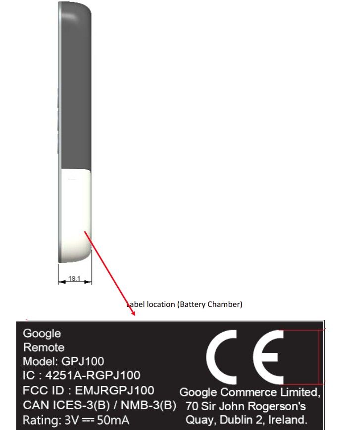
In early March, Stephen Hall from 9to5Google first revealed Google’s plans to launch a new streaming media device based on Android TV with the code-name “Sabrina”. The report mentioned that Google’s new device will come with a dedicated remote, which is in contrast to earlier Chromecast streaming media devices that were operated entirely from a user’s smartphone. The same day that report went live, a certification filing for a “Google Remote” went live on the FCC’s website. Although the front of the remote wasn’t visible in the FCC filing, 9to5Google reported that the new remote essentially looks like a cross between the Daydream View and Apple TV remotes and will feature a microphone, Google Assistant button, and likely an IR blaster to make it programmable.
Chromecast Ultra second gen TV remote

“Google Remote” with model name GPJ100 submitted to the FCC.

Janko Roettgers from Protocol reported in early May that this Android TV dongle will be sold under the “Google Nest” branding, which makes sense as Google has rebranded all of its other smart home devices under the Nest brand. The report as detailed on Protocol went on to say that Google is planning to revamp the Android TV UI with a more content-focused approach that places an emphasis on individual movies and TV shows rather than applications. At the same time, Stephen Hall from 9to5Google floated the idea that Android TV may be rebranded to Google TV, though it’s unclear at this point if Google has indeed settled on a name for its new streaming media device.

That brings us to today. While I am unfortunately unable to share any details on the branding, pricing, or availability of Google’s Android TV dongle, I can share what are likely official renders of the device. We obtained renders of the device code-named “Sabrina” from a pre-release firmware build shared with us by XDA Recognized Developer deadman96385.

Within the firmware was a marketing video created by a designer at Google. According to the file’s metadata, the video was created on October 10th, 2019, 5 days before the launch of the Pixel 4. The video is titled “OOBE_End,” where “OOBE” stands for “out-of-box experience,” and is shown to the user at the end up of the setup process. The video gives an overview of the Android TV dongle, remote, and new Android TV software that the user is testing. Since the video is several months old, we can’t confirm that the final design hasn’t changed slightly, but it’s likely the final product will look similar to what’s shown in the marketing video.

Google’s new Android TV dongle, Remote, and TV UI

Google’s upcoming streaming media device code-named “Sabrina” has an oblong shape, unlike the Chromecast Ultra’s rounded shape. Whereas Google’s third-generation Chromecast and Chromecast Ultra are only available in Black and White, it seems that Google’s new Android TV dongle will be available in Black, White, and a new light pink color. It’s difficult to describe the feel of the device just based on these images, but it appears it’ll have a smooth surface that gives the appearance of a sandstone-like texture.
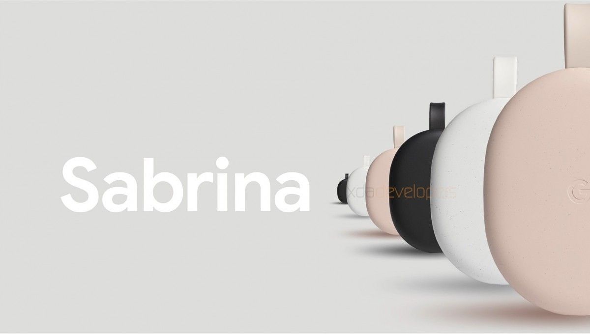
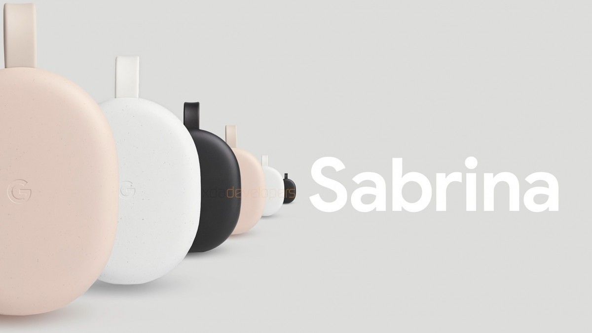
Google Android TV dongle Google Android TV dongle

The marketing video only shows the top half of the remote which reveals some of its controls including the rumored Google Assistant button. We’re not sure if there are dedicated Netflix or Amazon Prime Video buttons, which are both commonly found on remotes due to marketing decisions and licensing agreements. The remote is shown off in a plain white color, though there could be other colors to match the design of the Android TV dongle.

Google Android TV dongle remote

Finally, here are images that show off Google’s new content-focused Android TV UI. We can see a list of TV shows and movies at the bottom. In the middle, there’s an autoscrolling carousel of recommended titles along with the service provider that offers the content. Lastly, we can see that Android TV may soon be able to show alerts from Google Nest doorbells and video cameras, which is already possible on Assistant-powered smart displays.

Google's new Android TV UI Android TV nest alert

Besides the marketing video, we don’t have a lot of other information to share about the new Android TV dongle. A brief analysis of the firmware reveals that the device supports Dolby Vision and is based on an Amlogic SoC, but we don’t know the exact chipset that is being used. We expect this device to launch sometime within the next few months, though there could be unforeseen changes causing a delay. After all, the Pixel 4a is now rumored to launch in July and Google’s big Android 11 Beta Launch Show no longer has a confirmed date.

As for pricing, unnamed “industry insiders” told Protocol that they expect Google’s Android TV dongle to be priced around or below $80. That would make the pricing close to the $69 price point of the Chromecast Ultra and would be competitive with Xiaomi’s upcoming Mi TV stick. In contrast, NVIDIA’s SHIELD TV streaming stick costs $149, although that device is likely more powerful than Google’s upcoming offering. As Protocol reports, Google is mainly hoping to compete with Roku and Amazon in this space, though, so the company will likely have to cut some corners to sell at such a low price point. We’ll hopefully find out soon how low that price will be.

We reached out to multiple Google spokespersons prior to publication of this article but did not hear back before publication.

The post Exclusive: This is Google’s Android TV dongle, remote, and new UI appeared first on xda-developers.


from xda-developers https://ift.tt/2AtUz8u
via IFTTT

T-Mobile is offering 3 free months of Stadia Pro

Google Stadia is the hot new game streaming platform and it’s slowly getting better and better. Last month, the service received a number of new games and features, plus more are on the way. Google offered 2 months of Stadia Pro for free back in April, now T-Mobile is offering 3 months for free.

The offer is available today in the T-Mobile Tuesdays app. Users must save and redeem the Stadia deal in the app by June 9th, 2020 at 4:59 AM ET. As per usual, after the 3-month free period ends, users will be charged the standard Stadia Pro price of $9.99 per month, but it’s possible to cancel at any time to avoid that. The offer is valid for new accounts only and only in the US (excluding Guam, Hawaii, and the Virgin Island). Check the screenshot below for the full fine print.

This is a great deal if you’ve been itching to try out Stadia. The list of games available for free to Stadia Pro users is up to 17 titles. Some of the most recent additions include Get Packed, Little Nightmares, and SUPERHOT. Other popular titles include Destiny 2: The Collection, PUBG, GRID, and more. If you’re a T-Mobile user, be sure to check the Tuesdays app before it’s too late.

Thanks to Twitter user @zachmauch for the tip!

T-Mobile Tuesdays (Free, Google Play) →

The post T-Mobile is offering 3 free months of Stadia Pro appeared first on xda-developers.


from xda-developers https://ift.tt/3cqVJPi
via IFTTT

Google is testing sticker suggestions in Messages and Gboard

Stickers have become a critical part of the messaging game. Communication apps need to have stickers if they’re going to be seriously considered. People see emoji, GIFs, and stickers as a more deft way to convey feelings. Google has embraced stickers in may ways, including the bizarre and oddly fun “Emoji Kitchen” feature in Gboard. Now, the company is testing a couple of new features for Messages and Gboard to make them easier to find and use.

We’ll start with Google Messages, where the company is testing sticker suggestions. The suggestions appear above the compose box so you can easily add them to the conversation. The feature can be toggled with a new switch in the “Suggestion in chat” section of the settings. The feature was first discovered last October by Jane Manchun Wong, but it appears to be closer to release as some people are seeing it appear without tinkering.

Next up is Gboard with sticker suggestions in a different way. Instead of suggesting individual stickers (which it already could do), Gboard is testing suggestions for entire sticker packs. When you go to the sticker section of Gboard you’ll see a pack in front of the list with a yellow star icon. Tapping the suggestion will bring up the sticker pack and you can “Pass” on it to hide the suggestion or “Add” it to your collection. This appears to be a server-side test.

You can download the latest versions of Messages and Gboard from APKMirror, but that doesn’t seem to guarantee you’ll get these features.

Messages (Free, Google Play) →

Gboard - the Google Keyboard (Free, Google Play) →


Source: Android Police

The post Google is testing sticker suggestions in Messages and Gboard appeared first on xda-developers.


from xda-developers https://ift.tt/300FWUJ
via IFTTT

Make the Community Stronger & Give Back: Become a Mod on XDA

Have you been a member of the forum for at least one year?

Do you have at least 500 posts?

Have you gotten a lot out of XDA over the years?

Do you wish that you could do something to give back to the community?

Maybe you’re a bit OCD and just need some cleaning to do?

Then perhaps applying to be an XDA Moderator is for you!

On XDA, we have a small army of volunteer Moderators who spend their free time cleaning up spam, acting on reported posts, keeping the site organized, and helping people in the community. Since XDA’s founding in 2002, it has been our Moderators that have made the site a hospitable place for phone development, customization, and the formation of new friends (daww!!) Our Mods do it out of love for the site, for the Community, and because they are obsessed with phones and technology.

As the number of devices on XDA grows, so does our need for Moderators. We’re putting out a call for anyone interested in being a Mod!

What does the “job” entail?

  • Acting on reported posts
  • Deleting spam
  • Moving threads to proper sections (to keep things tidy!)
  • Helping users
  • Resolving conflict

What’s in it for you, you may ask? Well, as mentioned, this is a volunteer position, but being a Moderator on XDA means being a part of the biggest, most influential phone development site on the internet. Also, Moderators get access to our Ad-free template, which loads much faster than what everyone else uses, and when we roll out new site features, Mods get to test them out first. Mods also participate and contribute towards policy and site changes.

So what are you waiting for?

Apply now, and take a look at the requirements to make sure you qualify!

  Click to Apply!

The post Make the Community Stronger & Give Back: Become a Mod on XDA appeared first on xda-developers.


from xda-developers https://ift.tt/2pJxHrZ
via IFTTT

Sony uploads the kernel source code for the Xperia 10 II and Xperia 1 II

Back in February, Sony unveiled their “Mark 2” lineup, i.e. the flagship Xperia 1 II and the mid-range Xperia 10 II smartphones via an online event. Months after the initial announcement, the phones are now available for pre-order across Europe as well as in the US. On the software side, both of these devices run Android 10 out of the box. To satisfy the requirements of the GNU General Public License v2 and kickstart the custom development of third-party ROMs and kernels, Sony has now released the kernel sources for the Xperia 10 II and the Xperia 1 II.

Xperia 1 II

At the time of writing this article, we can only spot the kernel source for the SOG01 variant of the Xperia 1 II, which is sold by Japanese carrier au. The corresponding software version is 58.0.C.1.133, which is likely to be the factory-installed firmware for this model.

Xperia 1 II Kernel Sources || Xperia 1 II XDA Forums

Xperia 10 II

The release for the Xperia 10 II, on the other hand, is quite massive. Sony has uploaded the kernel sources for the Y!mobile/SoftBank variant (A001SO) and the global models (XQ-AU51 and XQ-AU52). The OEM has also shared the device configuration for the “seine” platform, which is the foundation of different Xperia 10 II models. As a result, developers can now start building vanilla Android 10 or port custom ROMs like LineageOS for this phone with relative ease.

Xperia 10 II Kernel Sources: A001SO || XQ-AU51/52 (59.0.A.1.296, 59.0.A.3.42, 59.0.A.3.45)

Xperia 10 II Device Tree || Xperia 10 II XDA Forums

Sony Mobile has a long, rich history of contributions towards the Android ecosystem. The company offers an official bootloader unlocking platform and they regularly publish AOSP building guides through their Open Devices Program. Sony has yet to formally include the “Mark 2” family of phones in that initiative, though, but the availability of the kernel source codes serves as the first stepping stone towards the progress.

The post Sony uploads the kernel source code for the Xperia 10 II and Xperia 1 II appeared first on xda-developers.


from xda-developers https://ift.tt/2XpXKqL
via IFTTT

Android 11 Beta 1 rolled out early to some Pixel 4 users: Here’s what’s new

The first Android 11 Developer Preview was released back in February, followed by Preview 2Preview 3, and recently, Preview 4. Google was supposed to release the Android 11 Beta 1 on June 3rd, but because of reasons, the Beta Launch Show has been postponed indefinitely, along with the beta release. However, Android 11 Beta 1 still rolled out early to some Google Pixel 4 users. They managed to get their hands on the latest official software update from Google, and have shared with us everything that is new on the Android 11 Beta 1 release!

All Android 11 News

New Features in Android 11 Beta 1

Music Player in Quick Settings Panel: Developer Option titled “Media Resumption”

Android 11 Developer Preview 1 tested out a rather controversial move of moving the music player notification up to the Quick Settings panel, letting it rest alongside the other toggles. To accommodate the music player, the Quick Settings panel will expand from one to two rows and will display the Quick Settings toggles on one side, while the music player will take up the other side. Opening the Quick Settings panel completely by swiping down once again will move the music player to the bottom of the panel, with all the toggles right above it.

This feature was present in the build but was not readily accessible, and had to be manually enabled. With Android 11 Beta 1, this feature is now finally accessible as an option. The change is that the music player now has moved to the other side of the toggles in the collapsed view, and to the top of the toggles in the expanded view.

The feature could still further change when it finally arrives on the official stable releases of Android 11.

New Icon Shapes: Tapered Rectangle, Pebble, Vessel

With the release of Pixel 4, Google introduced the Pixel Themes app. Pixel Themes lets you customize some parts of the UI such as the font, accent color, icon shape, and icon fill from a number of pre-installed choices. Developer Preview 4 had added two new icon shape options: Hexagon and Flower. Now, this list has been expanded with three more icon shapes: Tapered Rectangle, Pebble, and Vessel.

Android 11 Beta 1 Android 11 Beta 1 Android 11 Beta 1

If the pattern continues, we can hope to see more icon shapes added in further Betas.

Power Menu Settings for Device Controls

One of Android 11’s key features is the Controls API, which will let developers put home automation shortcuts in the power menu. In earlier previews of Android 11, there was a “Quick Controls” section underneath the row of power menu items up top while the rest of the power menu is transparent. In Android 11 Developer Preview 4, the power menu background is dark, including the power menu items up top. Furthermore, “Quick Controls” now says “Device Controls” and there’s a description text when it’s empty that says “Add controls for your connected devices”. When you add controls from a supported app, this text disappears to make room for your favorite controls.

Beta 1 brings new “Power Menu” settings, which will control the cards & passes and Controls features within the Power Menu.

Android 11 Beta 1 Android 11 Beta 1 Android 11 Beta 1

The animation provides further guidance on what we can expect on the Power Menu:

The users who received the new update could not test the new “device controls” feature since there are no applications available yet to end-users to test out the Controls API yet. That should change when Google hosts the Beta Launch Show.

Controlling App Suggestions in Pixel Launcher

The string of customizations continues in Pixel Launcher. Developer Preview 4 brought grid size customization, a tutorial for gestures, the ability to remove apps from the suggestions row, and hybrid hotseat — which suggest replacements for missing positions in the dock. Beta 1 now brings the ability to control app suggestions, along with some onboarding messages to introduce the feature to new users.

Android 11 Beta 1 Android 11 Beta 1 Android 11 Beta 1 Android 11 Beta 1

The contextual hotseat feature gets a helpful animation too:

New submenu for enabling Bubble notifications

Google introduced Bubbles last year with the second Android Q beta. The feature would allow users to view notifications and conversations from messaging apps in the form of floating overlays, pretty much like the Facebook Messenger’s chat heads. It wasn’t formally announced with the stable release of Android 10 but hidden in the developer options. With Android 11 Developer Preview 1, Google introduced new features such as the ability to take screenshots of just the bubble area instead of the entire screen.

Android 11 supports Bubble notifications by default, and now, Beta 1 adds a new submenu for enabling Bubble notifications. This submenu is present over at Settings > Apps & Notifications > Notifications > Bubbles.

Here is the animation that is shown on the page:

New developer option: “Wi-Fi-enhanced MAC randomization”

Starting with Android 8.0, Android devices use randomized MAC addresses when probing for new networks while not currently associated with a network. In Android 9, you can enable a developer option (it’s disabled by default) to cause the device to use a randomized MAC address when connecting to a Wi-Fi network. In Android 10, MAC randomization is enabled by default for client mode, SoftAp, and Wi-Fi Direct.

Android 11 Beta 1 introduces a new developer option called Wi-Fi-enhanced MAC randomization. This feature allows the MAC address to change every time the phone connects to a Wi-Fi network that has MAC randomization enabled.

Graphics for Accessibility Settings

This is a relatively minor change. Android 11 Beta 1 adds some graphics to some accessibility settings, namely for TalkBack and Select to Speak.


In-Development Features in Android 11 Beta 1

These features are present in Android 11 Beta 1, but they are in various stages of completion and are not ready just yet. We can expect to see these features coming to us in future releases.

Scrolling screenshots

Android 11 Developer Preview 1 included a new screenshot preview that hinted at support for scrolling screenshots. Unfortunately, scrolling screenshots are still not yet live on Beta 1.

Possible Clock customization for Lock Screen

There is a new entry within Settings > Styles and Wallpapers, called “Clock”. This settings pane contains only the default clock option for the lock screen. This hints that there may be further customizations or style options added in a future beta.


That’s all that we could find yet in this release. We expect Google to shed more light on the upcoming features when Android 11 Beta Launch Show is aired. Follow our Android 11 news tag to stay up-to-date on everything we’ve covered so far on the next Android OS release.

All Android 11 News

The post Android 11 Beta 1 rolled out early to some Pixel 4 users: Here’s what’s new appeared first on xda-developers.


from xda-developers https://ift.tt/3eID8ju
via IFTTT

ZTE Axon 11 SE launches in China with the MediaTek Dimensity 800 but is coming to Europe with a worse processor

Chinese smartphone manufacturer ZTE is known for its Axon series of flagships that offer top-of-the-line specifications at a very competitive price. However, despite offering some compelling products in the past, the company’s flagships haven’t received the same reception as some other affordable flagships from manufacturers like Xiaomi and OnePlus. For this reason, ZTE transitioned its Axon lineup to mid-range devices earlier this year with the launch of the new ZTE Axon 11 5G. Instead of Qualcomm’s flagship Snapdragon 865 chip, the Axon 11 packed in the mid-range Snapdragon 765G along with a few premium features. In keeping with this new trend, ZTE announced the Axon 11 SE in China yesterday featuring MediaTek’s Dimensity 800 SoC.

ZTE Axon 11 SE 5G MediaTek Dimensity 800

Priced starting at CNY 1998 (~$ 280), the new ZTE Axon 11 SE packs in a 6.53-inch FHD+ hole-punch display with a 60Hz refresh rate, a quad-camera setup with a 48MP primary sensor, and a rear-mounted fingerprint scanner. In terms of design, the Axon 11 SE is almost identical to the Axon 11, but the aforementioned specifications make it slightly less premium compared to the older device. While ZTE hasn’t revealed any information about an international release for either device, we now have reason to believe that the “international” Axon 11 SE will feature even worse specifications.

Slovenian telecom operator A1 recently launched the A1 Alpha 20+ in the country, which is the “international” variant of the ZTE Axon 11 SE. While most of the device’s specifications remain the same, the device is based on the MT6771T (MediaTek Helio P70) mobile platform instead of the much higher-end MediaTek Dimensity 800.

Furthermore, the ZTE Axon 11 SE was also spotted on Chinese certification authority TENAA’s website with the model number ZTE 9000N. The device was also certified by the Wi-Fi Alliance several months ago and the Firmware Version in the certification (TELMXZTE_9000V1.0) had confirmed it to be the A1 Alpha 20+. Additionally, XDA Recognized Developer deadman96385 has also shared the attached screenshot (see above), which reveal that the A1 Alpha 20+ goes by the model number P671F60, which is the same as the model number for the recently leaked ZTE Blade V 2020.

Thus, we can conclude that the ZTE Axon 11 SE (China) is the same device as the A1 Alpha 20+(Austria and Slovenia) and that it will be called the ZTE Blade V 2020 4G in other European markets. This information can also be confirmed by the press renders of the A1 Alpha 20+ on A1’s website, that show a design identical to that of the recently launched ZTE Axon 11 SE.

The post ZTE Axon 11 SE launches in China with the MediaTek Dimensity 800 but is coming to Europe with a worse processor appeared first on xda-developers.


from xda-developers https://ift.tt/301vwoa
via IFTTT