LightBlog

mardi 9 juin 2020

Vivaldi for Android gets updated with dark mode for web content

After several months of beta testing, the first stable version of the Vivaldi browser rolled out on the Google Play Store earlier this year in April. Much like several other privacy-focused browsers on Android, Vivaldi offered users features like a built-in ad blocker and cross-platform sync with end-to-end encryption, along with an inbuilt notes taker and a snapshot tool for productivity. While a few other browsers on the Play Store offer such features, what helped Vivaldi stand out was its integrated tracking blocker mechanism powered by the DuckDuckGo Tracker Radar tool. Now, the developers behind the browser are rolling out an update on the Play Store which brings even more new features.

Vivaldi browser dark mode for web pages

As per a recent blog post from the company, the latest update for Vivaldi on Android brings a dark mode for web content which adds to the light/dark themes already available for the user interface. As you can see in the attached image, once the dark mode is turned on it will automatically convert any web page to a dark theme. To enable the dark mode, users will have to head over to the Themes section in the browser’s Settings page and tap on the toggle next to the new Dark Mode for Web Pages option. Along with the new dark mode for web content setting, the update also brings minor improvements to the user interface, bug fixes, and performance improvements. You can download the latest update for the Vivaldi browser by following the Play Store link below.

Vivaldi Browser with ad blocker: fast & private (Free, Google Play) →

The post Vivaldi for Android gets updated with dark mode for web content appeared first on xda-developers.


from xda-developers https://ift.tt/3dMmY8B
via IFTTT

lundi 8 juin 2020

OPPO A12 budget smartphone with 4230mAh battery and dual rear cameras launches in India

Following the recent launch of the OPPO Band in China, the Chinese OEM has launched an entry-level smartphone in the Indian market. Powered by the octa-core MediaTek Helio P35 SoC, the new OPPO A12 packs in a 6.22-inch HD+ TFT display with a waterdrop-style notch and Corning Gorilla Glass 3 protection. The back panel on the device features a 3D Diamond Blaze Design, which resembles the back panel design of Realme C2, a circular fingerprint sensor, and a dual-camera setup.

OPPO A12 Specifications

Specifications OPPO A12
Dimensions & Weight
  • 155.9 × 75.5 × 8.3 mm
  • 165g
Display
  • 6.22-inch LCD
  • 720 x 1520
  • Gorilla Glass 3
SoC MediaTek Helio P35
RAM 3GB/4GB
Storage
  • 32GB
  • 64GB

Dedicated microSD slot

Battery 4,230mAh
Rear Camera
  • 13MP primary camera, f/2.2
  • 2MP depth sensor
Front Camera
  • 5MP, f/2.4
Android Version ColorOS 6.1 based on Android 9
Colors Blue, Black

The OPPO A12 is being offered in two RAM/storage variants, with the base model featuring 3GB of RAM along with 32GB of storage and the other variant featuring 4GB of RAM and 64GB of storage. In the camera department, the device features a 13MP primary sensor on the back with an f/2.2 lens and a 2MP secondary sensor for depth perception. Over on the front, the device features a 5MP selfie shooter with an f/2.4 lens. The device features a triple-slot SIM tray with support for two nano sims and a microSD card slot for expansion up to 256GB.

Rounding off the hardware is a 4,230mAh battery which, OPPO claims, can last up to 17 hours of online video streaming on a single charge. The OPPO A12 features a micro-USB port for charging and data syncing and doesn’t include any fast charging support. On the software front, the device runs ColorOS 6.1 out of the box, based on Android 9 Pie.

Pricing & Availability

The OPPO A12 has been priced at ₹9,990 (~$130) for the 3GB/32GB variant, while the 4GB/64GB variant will be available for ₹11,490 (~$150). Both the variants will be available in Black and Blue color options. The device will go on sale starting June 10 and OPPO has announced a couple of launch offers for early buyers. These include a 5% cashback on Bank of Baroda credit card EMI and Federal Ban debit card EMI options, six months extended warranty for customers purchasing the device before June 21, and no-cost EMI options on all major credit/debit cards.

The post OPPO A12 budget smartphone with 4230mAh battery and dual rear cameras launches in India appeared first on xda-developers.


from xda-developers https://ift.tt/2Yu904X
via IFTTT

Samsung’s Galaxy Wearable app confirms the Galaxy Watch 3 and the bean-shaped Galaxy Buds

Samsung’s Galaxy Watch smartwatches are some of the best smartwatches to pair with Android devices. They have great designs, modern processors for great battery life, run Tizen OS rather than Wear OS, and so on. Samsung’s Galaxy Buds wireless earbuds are also quite popular accessories among Android users owing to their great audio quality. Both of these product lines are something Samsung seems to update quite often, and this year will be no exception. We have been able to find assets in the latest Galaxy Wearable app that confirms the name of the next Galaxy Watch will be the Galaxy Watch 3  and also corroborates the bean-shaped design of the next Galaxy Buds.

Forget the Galaxy Watch 2, Here comes the Galaxy Watch 3

First things first, the Galaxy Watch 3. We’ve recently heard several rumors about the new Galaxy Watch, but we’ve assumed the new smartwatch will be called the Galaxy Watch 2 in absence of any evidence suggesting otherwise. That was until a certification filing with Thailand’s NBTC suggested the smartwatch will be called the Galaxy Watch 3.

This branding choice seems interesting because Samsung hasn’t released a Galaxy Watch 2 yet, though there is a Galaxy Watch Active 2. We argued that Samsung may have chosen this new branding because they don’t want consumers to assume that a new “Galaxy Watch 2” is equivalent or inferior to the existing Galaxy Watch Active 2. Plus, this wouldn’t be the first time that Samsung has skipped over a few a number with a new product. NBTC filings are usually accurate, but there’s always a chance it could have been a typo since that’s happened before with certification filings.

However, in the latest Galaxy Wearable app, we found an image asset specifically mentioning this Galaxy Watch 3 name. This asset comes directly from Samsung, so this new name is essentially confirmed.

The Samsung Galaxy Watch 3 recently got certified by the FCC in 4 different versions: Two in a 41mm size (one with just Wi-Fi/Bluetooth and one with LTE connectivity) and two in a 45mm size (again, one with just Wi-Fi/Bluetooth and one with LTE). These devices will likely come in both stainless steel and titanium, as per the FCC listings. Other leaks suggest the smartwatches will feature a physically rotating bezel, Gorilla Glass DX display, 5ATM water resistance, MIL-STD-810G durability rating, and GPS support, though we’re hoping they’ll also support ECG and blood pressure monitoring.

Galaxy Buds X….or Live?

As for the new Galaxy Buds, we found an image asset for a bean-shaped earbud. We’ve previously seen renders of the upcoming Galaxy Buds “beans” via Roland Quandt of WinFuture, as shown in the featured image above. The new image we found in the Galaxy Wearables app had the string “buds_live” appended to the end of the filename, but we weren’t able to find any other reference to the “Buds Live” name. Samsung filed several trademarks for a “Galaxy BudsX“, so that could also be the name of the new Galaxy Buds. This product is rumored to support Active Noise Cancelation and improved internal speakers.

Both of these products seem to be in the final stages of development for launch. Samsung usually doesn’t add assets for new products until right before they are ready to launch, so there is a chance these could launch before the next Samsung Unpacked that is rumored to take place on August 5th. Either way, I’m really excited to see both of these products and everything new they bring!

Galaxy Wearable (Samsung Gear) (Free, Google Play) →

The post Samsung’s Galaxy Wearable app confirms the Galaxy Watch 3 and the bean-shaped Galaxy Buds appeared first on xda-developers.


from xda-developers https://ift.tt/2ziTiRu
via IFTTT

Google Chrome for Android is getting a redesigned Autofill UI

One of the single most useful and time-saving features of Android is Autofill. It makes the process of setting up a new phone a breeze. You don’t have to worry about typing a bunch of usernames and passwords for every app you use. This is especially useful in the browser, and it looks like Chrome for Android is starting to roll out a redesigned Autofill UI.

chrome for android chrome for android

Images via: 9to5Google

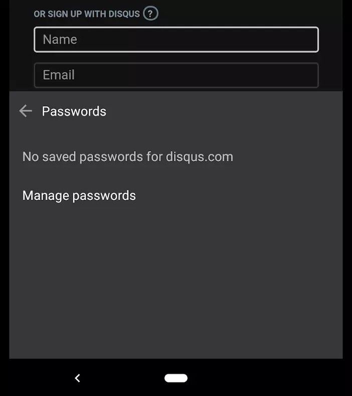
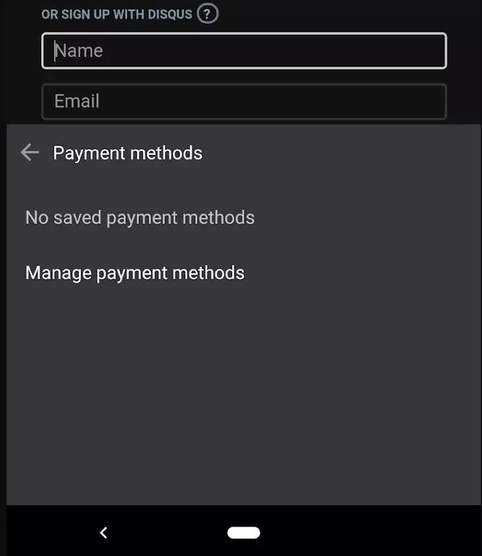
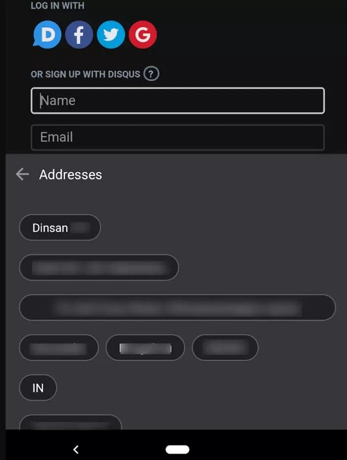
The old Autofill UI would show a pop-up from the text box with the available username/passwords. You could choose the one that you want or go to “Manage addresses,” etc. The new UI puts this in a bar that appears above the keyboard. The autofill information is available in a horizontally scrollable list. You will also notice three icons for passwords, payment methods, and addresses.

Images via: Chrome Story

Tapping these icons will bring you to a screen that displays the associated saved information in portions. This allows you to select different parts of the information at a time. For example, you could grab only your street address or maybe just a username. This comes in handy if a form doesn’t follow the typical standards and Autofill has trouble filling it in correctly.

This new UI seems to be present on recent versions of Chrome for Android Dev and Canary. Notably, the new UI has been in testing for over half a year now, but enabling it previously required toggling some Chrome flags (via AndroidPolice). Chrome Dev is currently on version 85, which is expected to be stable in August. It’s possible we will see the new UI roll out for everyone at that time.  Autofill is an enormous time saver when filling out forms in Chrome. This new functionality looks to make the experience even better and more useful.

Chrome Dev (Free, Google Play) →

Via 1: Chrome Story | Via 2: 9to5Google

The post Google Chrome for Android is getting a redesigned Autofill UI appeared first on xda-developers.


from xda-developers https://ift.tt/30lS6aV
via IFTTT

Huawei releases its “Contact Shield” API for COVID-19 contact tracing

As many countries around the world are lifting their stay-at-home orders, public health agencies are scrambling to implement contact tracing to limit a resurgence of COVID-19. Several app-based contact tracing solutions have arisen in the past few weeks, some of which are based on Google and Apple’s Exposure Notification API, and now developers of public health agencies have access to another COVID-19 contact tracing API: Huawei’s Contact Shield API.

In an update to version 4.1.0.301 of HMS Core, Huawei’s alternative to Google Play Services, Huawei’s new Contact Shield APIs were added “to provide fundamental capabilities to help minimise the spread of COVID-19.”

HMSCore Contact Shield API

Huawei has not yet formally announced its new Contact Shield APIs, but a spokesperson for Huawei pointed us to its documentation on Huawei’s developer site. According to the API’s Service Introduction page, the Contact Shield API “provides privacy-protecting contact tracing services for Huawei device users.” The API “utilizes the Bluetooth low energy (BLE) technology to detect nearby devices, exchange data with detected devices, and record contacts with user information anonymized.” Google and Apple’s Exposure Notification API also uses Bluetooth for contact tracing.

A separate page provides further details on Huawei’s new API. The page does not explicitly answer whether or not Huawei’s API is related to Google and Apple’s Exposure Notification API, but Google told the press back in April that the company “intends to publish a framework that those companies [such as Huawei] could use to replicate the secure, anonymous tracking system developed by Google and Apple.” Huawei’s Contact Shield FAQ page continues by listing several bullet points on how its contact tracing API is alleged to protect user privacy, all of which are similarly worded to privacy guidelines outlined in Google and Apple’s implementation.

For quick reference, here are the bullet points:

How does the HUAWEI Contact Shield protect user privacy?

  • Users can determine whether to enable Contact Shield, whether to upload anonymous identifiers to the cloud, and whether to obtain diagnosis results by themselves.
  • Using anonymous identifiers will not record or store any personal information such as user locations. These identifiers will only be stored for 14 days.
  • After a user uninstalls your app, the user’s historical data stored on the device will be deleted. A user can also manually delete all historical data.
  • Only developers authorized by governments and strictly assessed by Huawei can use Contact Shield APIs to develop apps.
  • Huawei will sign an additional service agreement stating the user privacy protection requirements with eligible developers.

So far, only a handful of countries have implemented Google and Apple’s Exposure Notification contact tracing API into their applications. The latest version of Google Play Services includes the API, but several Huawei and Honor-branded smartphones released after the U.S. trade ban do not have Google Play Services pre-installed. On those devices, which include the Huawei Mate 30, Huawei P40, and Honor 30 series, users will be able to partake in COVID-19 contact tracing once developers of public health agencies implement Huawei’s new Contact Shield API.

Thanks to Discord user SerjSev for the tip!

The post Huawei releases its “Contact Shield” API for COVID-19 contact tracing appeared first on xda-developers.


from xda-developers https://ift.tt/3cJyS1y
via IFTTT

Google Duo now lets you share invite links for group video calls like Zoom

The sudden influx of people working from home and practicing social distancing created a massive demand for video calling apps. Zoom, for better or worse, grabbed a lot of those new users, and other apps have been trying to catch up. Google Duo has been slowly adding features to get on par with the likes of Zoom and a big one is finally going live.

Over the last few months, Google Duo has been adding features to make it better suited for group video calls. They bumped the call size from 4 people to 8 and then to 12. Google has also been working on making it easier to add people to group calls, and now you can do it with a simple invite link.

First discovered in an APK teardown in April, Google has been preparing this feature for a while. The company officially announced it early last month, but it didn’t appear to roll out until a few weeks later. Now, we can finally safely say it’s widely rolling out. I was able to create a group and see the invite link option.

When you create a group in Google Duo, you’ll see a text box with a link that you can easily copy or share directly through another app. Anyone with a Google account can join the group. You do have to create a group first to get the link, but this makes it much easier to send out a message to a group of people rather than selecting them one by one.

Google Duo has quietly become one of the company’s more successful messaging services. It’s very simple when compared to many video calling apps, and it’s easy to invite others since most people already have Google accounts. The invite links feature appears to be live in version 89 of the Android app. Download it from the Play Store link below or from APKMirror to give it a try.

Google Duo - High Quality Video Calls (Free, Google Play) →


Via: Android Police

The post Google Duo now lets you share invite links for group video calls like Zoom appeared first on xda-developers.


from xda-developers https://ift.tt/2AMqRfc
via IFTTT

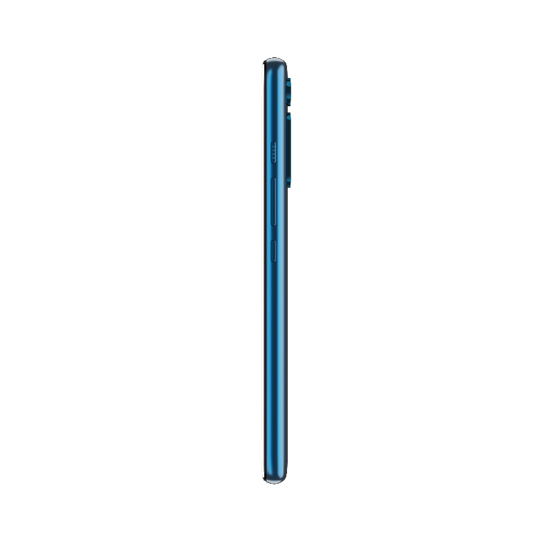
Motorola One Fusion+ is a mid-range Android smartphone with a 16MP pop-up camera

There is a lot to love about Motorola smartphones. Their software builds are pretty clean if not outright stock Android (on Android One models), pack decent hardware for the price, and sometimes even push the envelope—just look at the Motorola Edge devices with their curved “waterfall” displays. What really carries Motorola, though, is the brand’s selection of budget and mid-range smartphones. Now, the Lenovo-owned brand is launching yet another mid-range smartphone: the Motorola One Fusion+. Although Motorola published a product page for this device, they have not made a formal announcement as the device is not actually available for purchase yet.

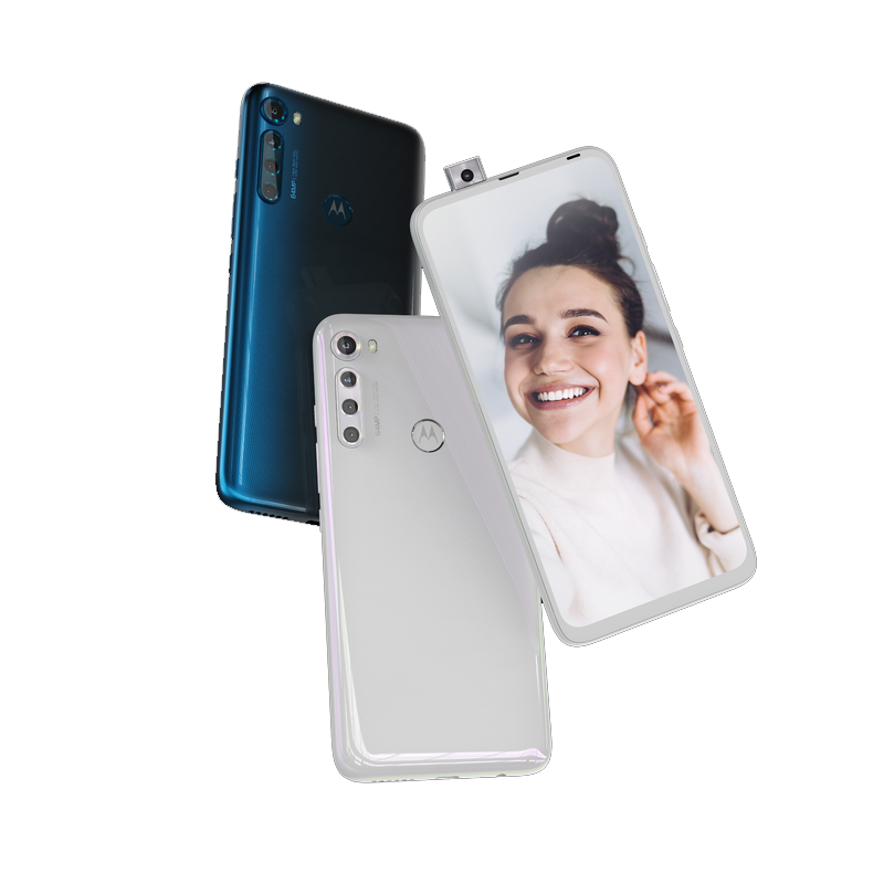
Perhaps the most interesting bit about the Motorola One Fusion+ is the display. It is a 6.5″ IPS TFT LCD panel at 2340×1080 resolution, 19.5:9 aspect ratio, and 60Hz refresh rate. There’s no display notch or hole-punch cutout, though, as the 16MP front camera is housed in a pop-up component. Pop-up cameras are not a new technology and are also not even new for Motorola—the company previously launched the Motorola One Hyper with a pop-up camera at the end of last year—but they’ve recently fallen out of favor among smartphone manufacturers. Thus, it’s nice to see its use in this device as it allows users to have a truly “full-screen” experience.

Specification-wise, the Motorola One Fusion+ seems like a decent mid-range smartphone. It has the Qualcomm Snapdragon 730, 6GB of RAM, 128GB of internal storage (expandable via a microSD card slot), and runs Android 10 out-of-the-box (given Motorola’s update track record, don’t expect a lot of software updates, though). The One Fusion+ also has a rear-mounted fingerprint sensor as well as a quad rear camera setup with a 64MP sensor leading the pack alongside an 8MP ultra-wide angle sensor, 5MP macro sensor, and 2MP depth sensor. Other noteworthy specifications include a 5,000mAh battery (with support for 15W charging) which should be able to provide plenty of juice throughout your day and even more, a single loudspeaker, a 3.5mm headphone jack, a dedicated Google Assistant button, and 2 microphones.

The Motorola One Fusion+ has dimensions of 162.9 x 76.9 x 9.6mm and weighs 210g. Its body is plastic and comes in “Moonlight White” and “Twilight Blue” colors. It is not available for purchase at the moment, but it should become available very soon. GSMArena reports that the phone will be available in Europe later this month for €300. You can check out the listing at Motorola’s website right here to know more.

The post Motorola One Fusion+ is a mid-range Android smartphone with a 16MP pop-up camera appeared first on xda-developers.


from xda-developers https://ift.tt/2Uoq8rp
via IFTTT