Gmail is one of the most popular email services in the world and the web client is used by millions of people every day. The general interface for Gmail on the web has improved a lot over the years, but navigating the settings can still be a challenge. Thankfully, Google is finally revamping the Quick Settings menu to make it much more useful.
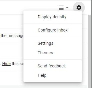
Currently, Gmail on the web has a Settings cog icon in the top right corner under your profile photo. Clicking this icon brings up a few quick options and shortcuts to the full Settings and Themes. There’s not much you can do from the menu itself, it’s more of a launchpad to more. Google will soon move the Settings icon up to the very top of the screen next to the Google apps launcher. The menu itself is getting much more useful.
The new Quick Settings menu allows Gmail users to do much more before being sent off to separate sections of the Settings. You can customize the density of text and information displayed, choose a different inbox type, add reading panes to quickly see email contents, and apply different themes. All of this happens directly from the menu, no need to go to the full Settings page.
This new menu for Gmail on the web will be available to both G Suite users and personal Gmail accounts. Google says the rollout has started already, but it could take up to a month before everyone gets it. This is a server-side switch, so there’s nothing you can do to force it. This is a much-needed update for the web client and we can’t wait to get it.
Source: Google
The post Gmail for web gets a more useful Quick Settings menu appeared first on xda-developers.
from xda-developers https://ift.tt/2TLerKX
via IFTTT


Aucun commentaire:
Enregistrer un commentaire